Colour theory is the use of colours on the colour wheel that compliment each other and of the rules that designers and artists would use in order to communicate feelings and emotions through knowledge about the human psyche and culture as this will be one the variables that affect how they would perceive certain colours. colour theory is important in fashion as it gives the designer the power to bring designs to life.
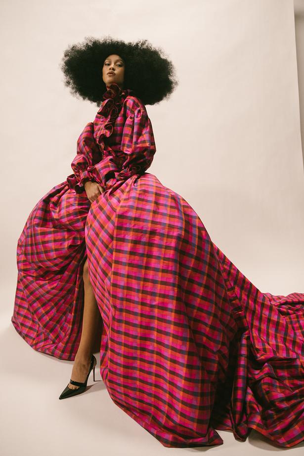
This met gala piece is the epitome of colour theory in the fashion industry. The reds, oranges and pinks all work simultaneously together in this piece. This dress was a statement and was clearly used to make her stand out, as it was to help represent the movement ‘black lives matter’. It is almost as if vogue is focused on bringing back old trends to the modern day and putting a twist on them so they fit in more with the 21st century.
The shape of the dress is significant as it was bigger than a lot of the dresses that year in the met gala. Vogue states that they were researching for years before bringing out the design of the dress due to amount of history that went behind it. They stated it “to be the most politically charged fashion exhibition ever staged by a major museum.”
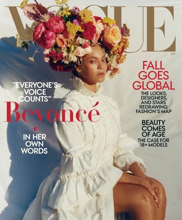
In my opinion, this magazine cover has a bad representation of colour, although he flowers give the impression of autumn the colours give a spring vibe, the colours are vibrant and pretty, unlike what you would typically see in fall which would be darker colours such as burnt oranges and burgundy. The model is clothed in white which again does not match up with the words. The image itself gives a sense of disorientation as i feel like nothing really goes together.
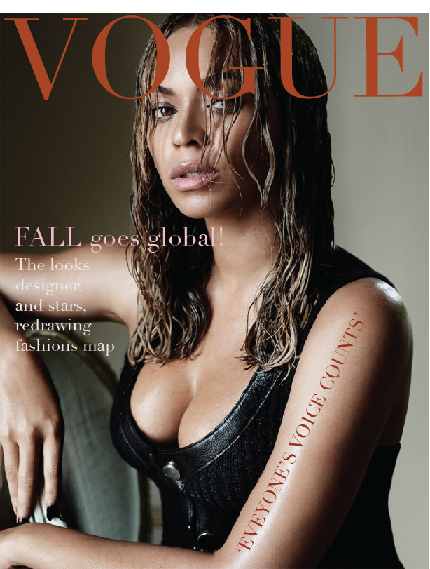
This is my redesign of the example above, i used a darker more deep image to give a sense of coldness and more of an autumn feel. I decided not to add in all of the text from the original design as I feel it was slightly unnecessary and overcrowded.
the Guardian. (2021). ‘Fashion rooted in values’: Met Gala to open show honouring designers of colour. [online] Available at: https://www.theguardian.com/fashion/2021/sep/10/fashion-rooted-in-values-met-gala-to-open-show-honouring-designers-of-colour [Accessed 4 Nov. 2022].
Storm, M. (2018). Beyonce’s ‘Vogue’ Cover Glow Requires Just 3 Makeup Products. [online] Us Weekly. Available at: https://www.usmagazine.com/stylish/news/beyonces-september-2018-vogue-cover-marc-jacobs-beauty-products/ [Accessed 4 Nov. 2022].