Font families are essential in making sure the typefaces compliment each other , too many different typefaces can make the appearance jumbled up and messy, font families are different fonts of the same origin, so they are similar in origin but are not the same. Word length is something to think carefully about because it varies in different languages. For example in English the word ‘ok’ would translate to ‘d’accord’ in French which is 7 letters long.
Serif fonts are typically believed to be a roman typeface with flicks and strokes at the ends of the letters, serif fonts are also usually extensive in text such as books and newspapers which require quite traditional fonts.
San serif fonts are the newer typeface which appear to be more clear and visible when printed either large or small. These are more frequently used on computers and display screens


Typography in the fashion industry
In my opinion typography in fashion is one of its defining elements which could change how a brand presents themselves to their target audience. Particular fonts will stand out to the crowd whereas as some could perhaps deter them away due to a dull or unappealing logo or representation of the brand. Most brands tend to use a sans serif font due to its modernity and simplicity which could present to people a clean and fresh look.
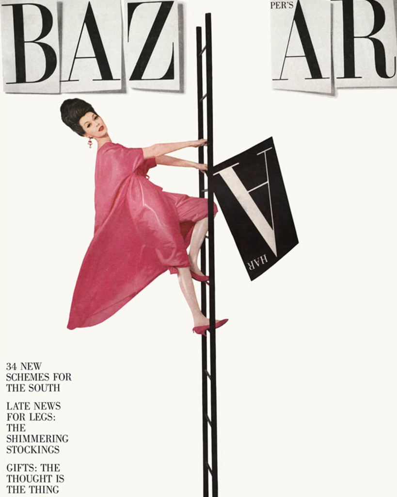
In my opinion this would make a good example of typography because of the fact that it has movement and dimension to it rather than most traditional typography. I was extremely intrigued by an article written by nick knight where he commented on a cover design, designed by Alexey Brodovitch. He mentioned that ” if fashion can be shown in movement why cant type”. The retro take on this is fascinating and somewhat relates to our modern version of vogue and many other fashion magazines, where they execute a very similar vintage/retro typeface and style. The idea of the woman being on a ladder to allude to the idea that perhaps we are moving up in terms of type alongside fashion, and we are continuously growing and developing ideas within the industry. The use of capital letters makes a bold statement for the magazine and draws readers to the singular black letter held by the lady in pink, the only colour on the entire page. The lack of punctuation and symbols causes it to be easier to read and more simple to the readers eye.
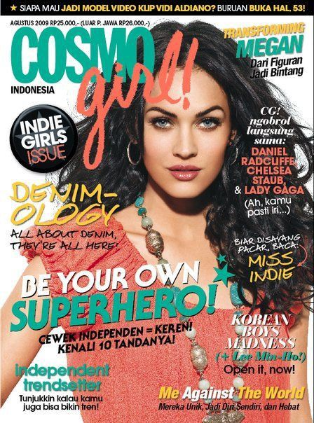
I chose this piece of ‘bad’ typography on the front of a magazine cover. The first reason I think this is a bad example is due to the to the multiple contrasting colours some of which clash which the woman’s top colour, the different colours do not blend well together and are distracting alongside the amount of different fonts used on the cover. The different colours match up with different words and in my opinion would possible be extremely confusing for the reader to understand what is going on and what is being said. There is some unnecessary information and titles on this page, causing it to become overcrowded with words and letters. Some of the fonts on the page are also quite scribbly and harder to read clearly. Some of the words which clearly have no significance are written in big bold letters, which gives me the impression they were simply written that way because the designer felt like it.
To improve this piece I would make a lot of the font more similar and maybe stick to just two or three, and i would also change the colours of the font to match up to the coluor theory, so that all the colours will be able to compliment each other and not confuse the reader. I will only be including the information that is absolutely crucial, as the rest of the word can go inside the magazine they do not to be presented on the front cover.
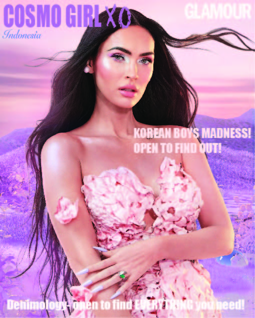
This is my redesign of the Cosmo girl magazine. My main aim was to take away all of the unnecessary information and only add in the vital pieces. I also ensured to keep most of the fonts similar or the same to make it look cleaner and more organized. I used the pin dropping tool on adobe illustrator to select the font colors from the colors in the background of the picture so that the colors would compliment each other. The only word I used a different typeface for was was ‘Indonesia’ to specify that the magazine was an edition from Indonesia and I also used a chalk like typeface for the ‘xo’ next to Cosmo girl to give the magazine cover a more teenage feel to it and slightly less sophisticated.
www.google.com. (n.d.). serif fonts designer – Google Search. [online] Available at: https://www.google.com/search?q=serif+fonts+designer&tbm=isch&ved=2ahUKEwj3mpWmm8T6AhWR0oUKHdLGAi8Q2-cCegQIABAA&oq=serif+fonts+designer&gs_lcp=CgNpbWcQAzoECCMQJ1CwB1iuFWDPF2gBcAB4AIABPIgB3gGSAQE0mAEAoAEBqgELZ3dzLXdpei1pbWfAAQE&sclient=img&ei=–k6Y7exDJGllwTSjYv4Ag&bih=1361&biw=2560 [Accessed 4 Nov. 2022].
www.showstudio.com. (n.d.). Fashion’s Relationship With Typography: Arming Us For the New Age | SHOWstudio. [online] Available at: https://www.showstudio.com/news/fashions-relationship-with-typography-arming-us-for-the-new-age [Accessed 4 Nov. 2022].
Pinterest. (n.d.). Pin by Tara on Magazines & Photoshoots | Bad design, Hierarchy design, Typographic layout design. [online] Available at: https://pin.it/13OywxJ [Accessed 4 Nov. 2022].
www.google.com. (n.d.). megan fox magazine cover picture – Google Search. [online] Available at: https://www.google.com/search?q=megan+fox+magazine+cover+picture&rlz=1C1GCEB_enGB1028&oq=megan+fox+magazine+cover+picture&aqs=chrome..69i57j33i160.12136j0j1&sourceid=chrome&ie=UTF-8#imgrc=8MMnGaaEVC4kcM [Accessed 4 Nov. 2022].