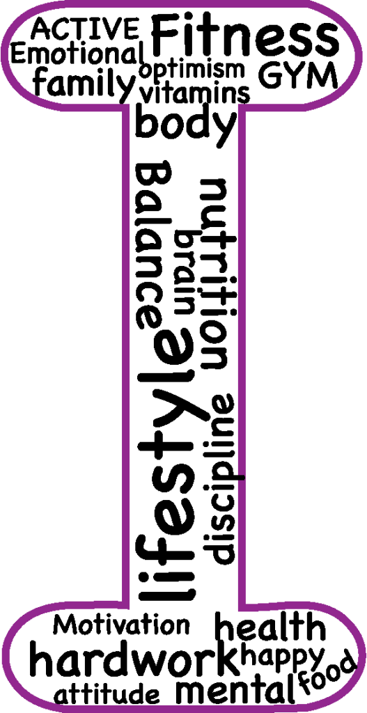
This is my first logo design for my typographical name logo, I used an I here as it is the first letter of my name. I filled this outline with words that make me happy, or simply words that describe such as ’emotional’ and ‘optimistic’. I first drew a mind map, and jotted down the first words that came to mind when I thought of myself. I used purple as the outline as it is one of my favorite colours. The font I used for the outline was Arial Rounded MT Bold. The reason I used this font is because I like the rounded effect it has and it sort of brings back the playfulness of the piece.
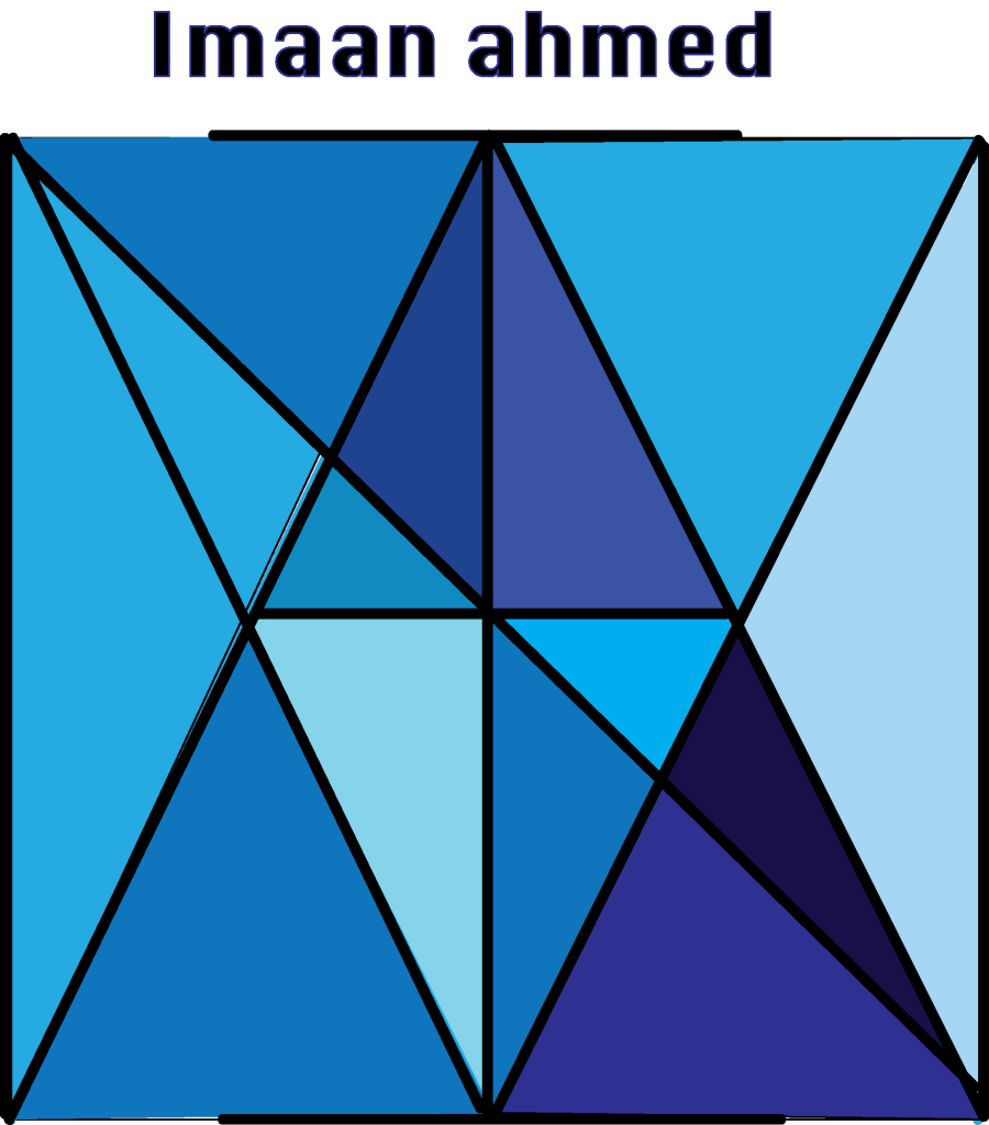
This is my second typographical name logo. I used my full first name for this logo, hence the lines throughout the square. If you look closely all of the letters within the square are the letters within my name. Naturally, triangles were created as i was spelling my name, I decided to turn the triangles into diamonds by filling them with different shades of blue and turquoise. This then created the illusion of one large diamond. This is significant to me because when I was younger my grandma called me diamond. I used the paintbrush tool to create the initial box, I then went over with a thicker paintbrush to make the lines stand out and make the letters more visible and prominent.