Channel content – YouTube Studio
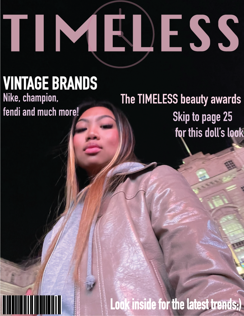
Having my covers look minimalistic was important for me as it went with the masthead which was timeless, I felt as though this heading needed a very sleek and modern look in order to execute how I had envisioned. I tried my best to everything on my page very centered and brought the attention to where I wanted the viewer to have their main focus , which on this cover, was the headline and the models leather jacket, which will forever be a timeless piece.
For each of my designs I used a compositional grid format which allowed all three of my designs to flow when placed side by side. I created my own barcode to make the cover more authentic looking real. I feel as though my masthead and font choice definitely gives the magazine a more minimalistic feel and draws more attention to what is actually there. I changed my masthead quite a few times as it did not look quite right with the images I had photographed and chosen to use for my covers. My aim for this cover was to have abstract space in which to model would not be compromised with text, this is why the model is more on the right hand side rather than in the center, with the text alongside her on the left. I used the eyedropper tool to make the colours of the headline flow with the cover image, giving it a softer and more elegant look next to the Eifel tower. The bright pop of yellow refers back to the Eifel tower in the background, therefore referring back to the idea of fashion being timeless and chic. I really enjoyed designing this cover, when most people think of chic fashion they think of Paris and the Chanel stores in France, although the models attire is not your typical French attire, i feel like this cover is a twist between a chic Parisian vibe and early 2000’s streetwear. The early 2000’s style is a huge part of fashion as it goes in and out of fashion throughout the years, even the baguette bag the model has on her shoulder is a representation of the chicness and elegance y2k style can have.
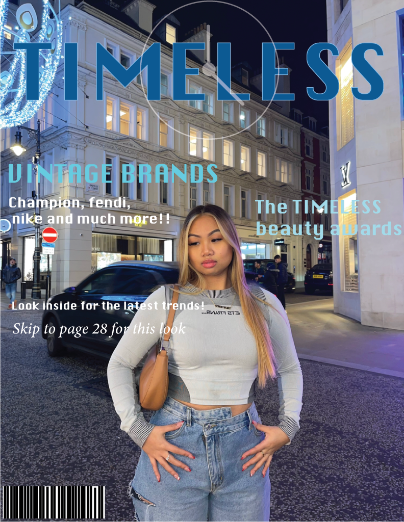
To me, my mastheads give across a strong and powerful feeling, this is because of the angle of the images and the placement of the headlines. With all of my cover designs i adjusted the colours according to the colour wheel, making sure that they blended in with the theme of the image. I also adjusted the fonts of each headline in accordance with the vibe i wanted to get from the the cover, for example my second cover, I wanted it to give off a cool vibe, with was very modern but still quite timeless with the vibe and colours of the photograph.