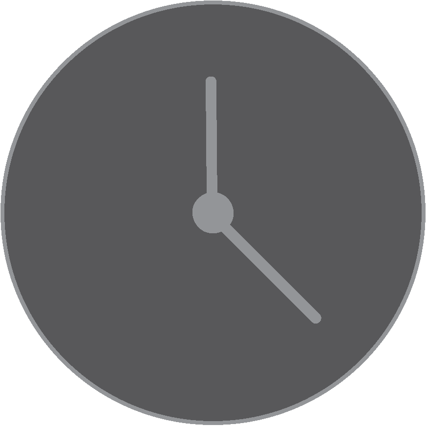
The reason for me choosing a clock as my masthead was because my heading was “timeless”, to represent chic trends that never really go out of fashion, and i felt as though a clock for a masthead was appropriate. With this masthead, I first started off with trying to turn one of the letters in my heading into a clock, the reason that this did not work was because it was not clear that it was a letter as well as the hands on a clock. Because of this I then decided to make my masthead separate from the heading of my magazine. I first began with the clock being completely opaque however it did not look enticing as it would clash with the letters and would not be aesthetic enough for my liking, I then tried turning down the opacity on the clock down to around 40% so that it would show but not take the attention away from the main cover. When it came to the making of the actual clock I drew it with the elipse tool and the paintbrush tool. I thought of adding minute lines however I thought that the simple minimalistic look would have suited my font and cover page more. Also I was against the idea of using black or white as I though it was quite typical and boring, instead I experimented with colours that I was using in my cover page, for example using the eyedropper tool to get the shades and colours more accurate. Using these colours made it easier to focus on the title rather than the logo, with the logo still making an appearance in the background. I placed it in the center of the title and enlarged it whilst keeping the opacity fairly low.