Zaha Hadid was an Iraqi British architect who used abstracted paintings to visualize her concepts and buildings and bring them to life. She is most known for her radical and deconstructivism designs. She gained recognition once winning her entry for 'the peak', at this time people were more focused in on post modernism therefore Hadid's designs stuck out and made her unique as opposed to other architects at the time. Smooth curves are a recurring motif in Zaha's designs; they create an opulent and affluent sense, giving her structures a certain fluidity and sleekness. In recognition of her preference for using curves rather than crisp, angular forms, Hadid has earned the moniker "Queen of the Curve." Architectural conventions were frequently questioned by Hadid. She gave preference to aesthetics above practicality and used minimalist design principles to produce ornate, elaborate constructions.
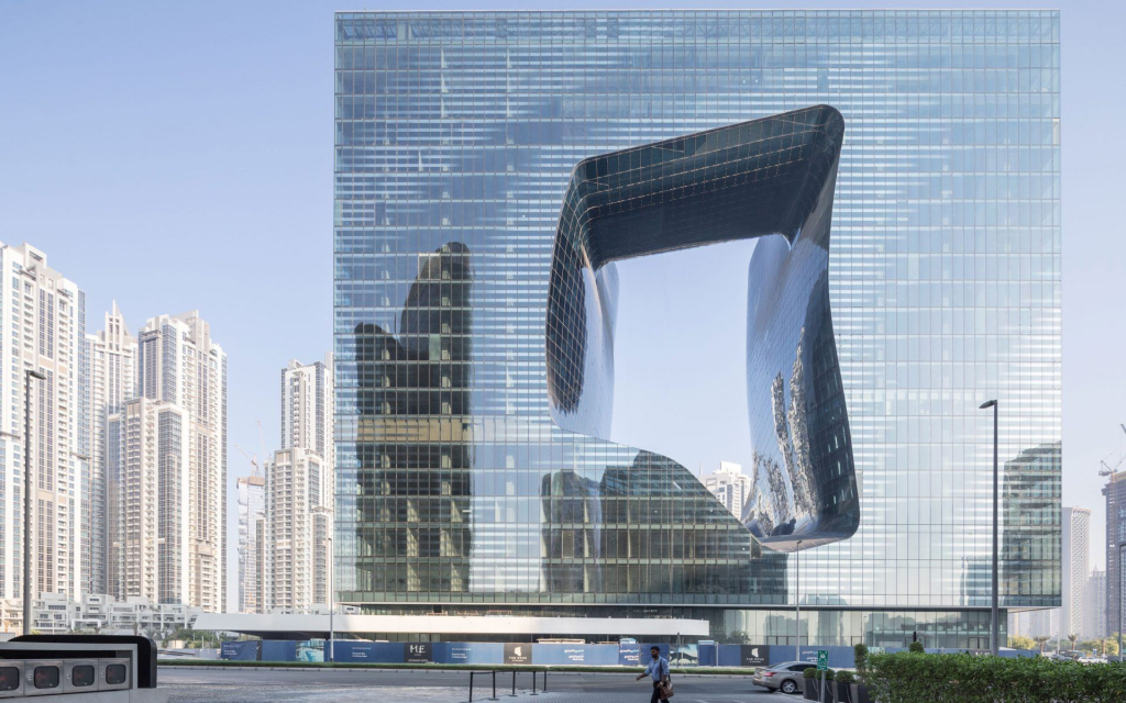
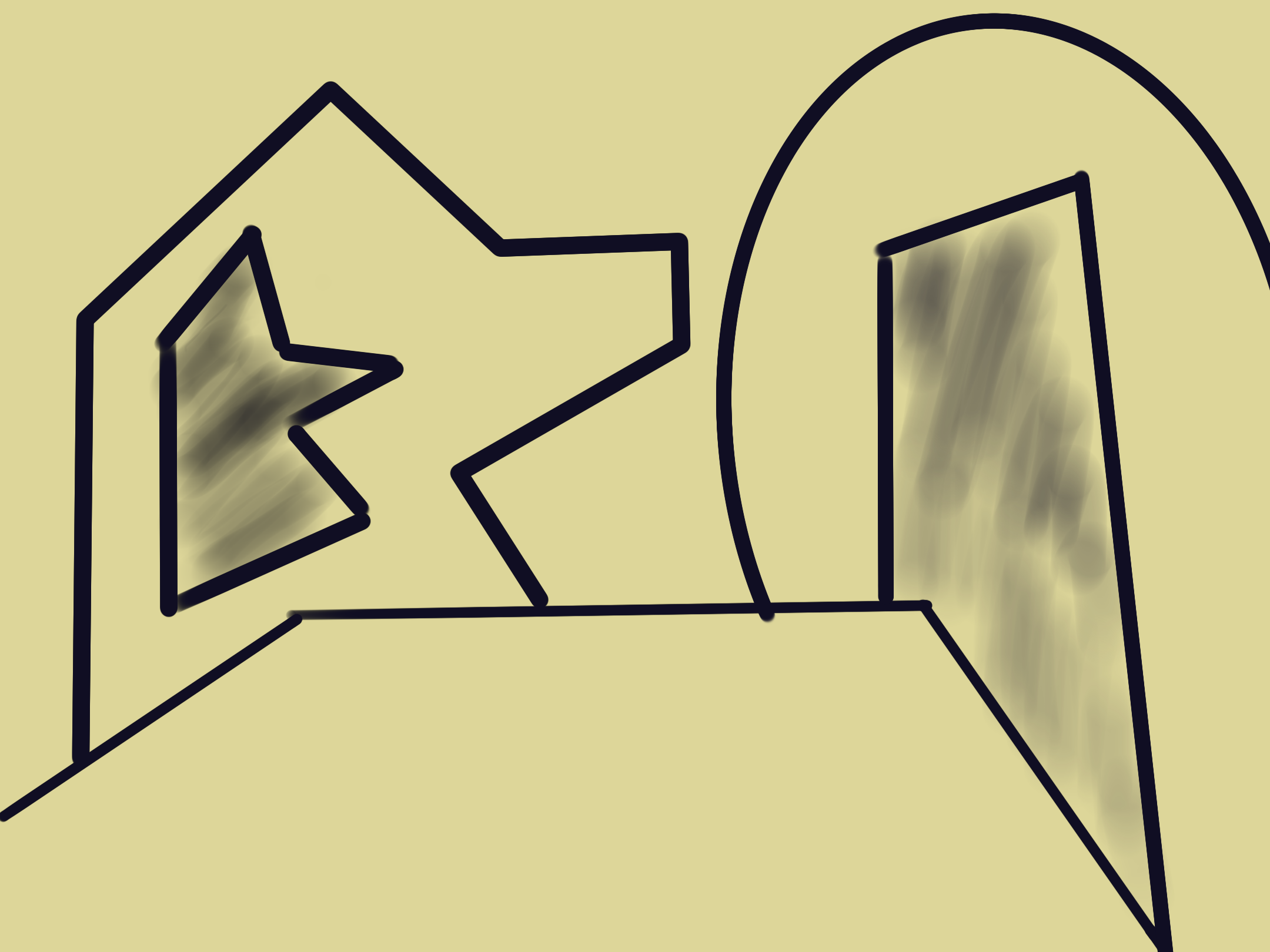
For a few of her designs, she received a lot of negative feedback during her career. One example is the Vauxhall Cross Island site in London, which has drawn criticism for crowding the region with buildings that are overly tall and casting a shadow over the nearby surroundings. My first illustration is inspired by the building on the left, I simply drew the shapes that I saw and that first came to mind which in this case were shapes within shapes, abstractly drawn.
For this redesign that I did I used colour I saw in the original building, which gave off a very majestic and luxurious feeling with the hints of yellow and gold. I simply drew the lines that were apparent to me and made sure to draw it at an angle to give the effect of a larger building with much more depth.
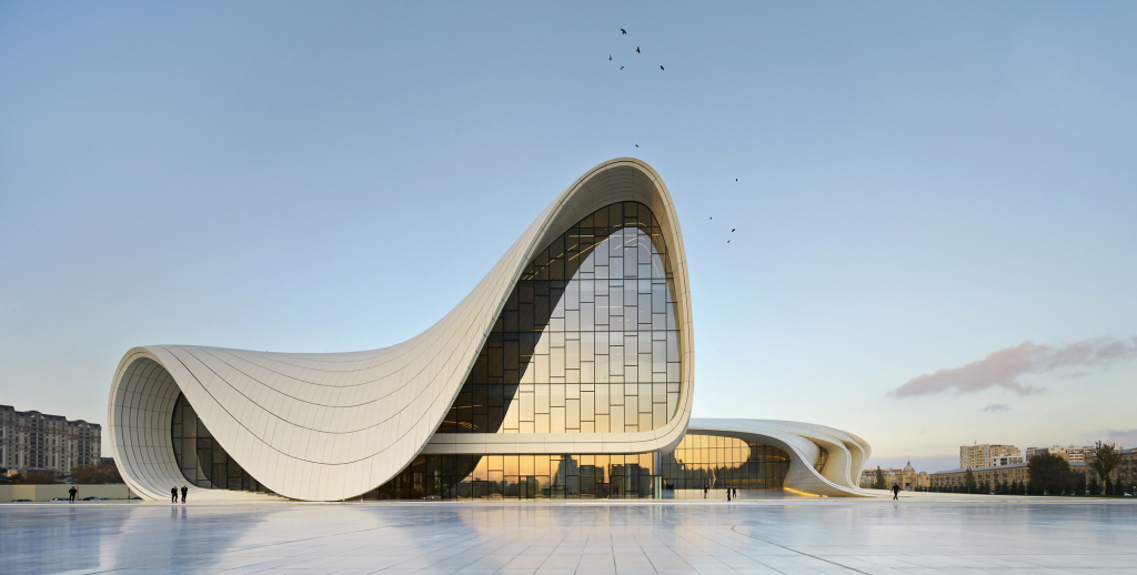
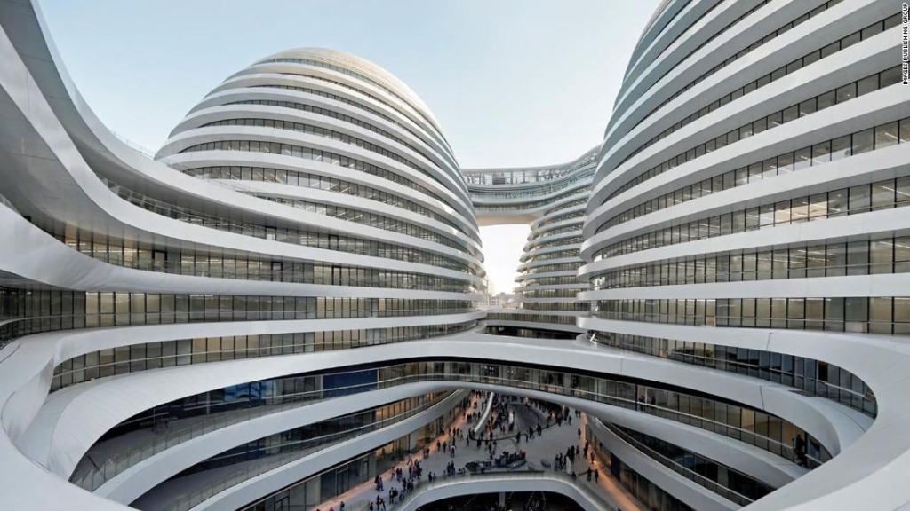
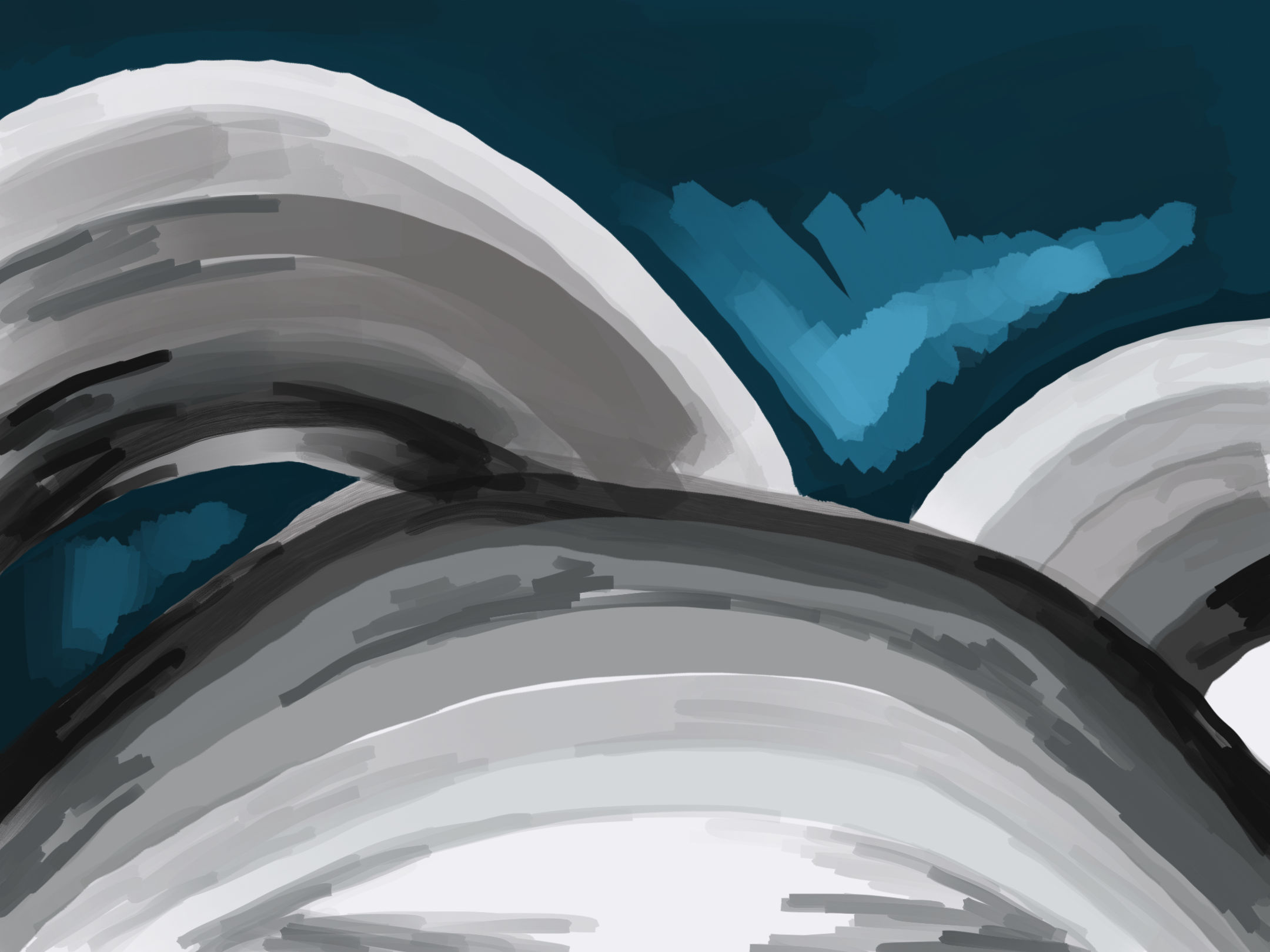
This Zaha Hadid design gives me universal vibes, and somewhat of the galaxy, with a very circular exterior and no straight edges except for the windows, everything is rounded off. I used a colour with a blue hint in the background to emulate the sky, I used the pen tool to create rougher and sketchier edges so that it would show I drew it, as she drew her original designs. I used black but turned the opacity down on each ring to lighten the colour and give the illusion of a ring that gets larger and smaller as you get closer to it.
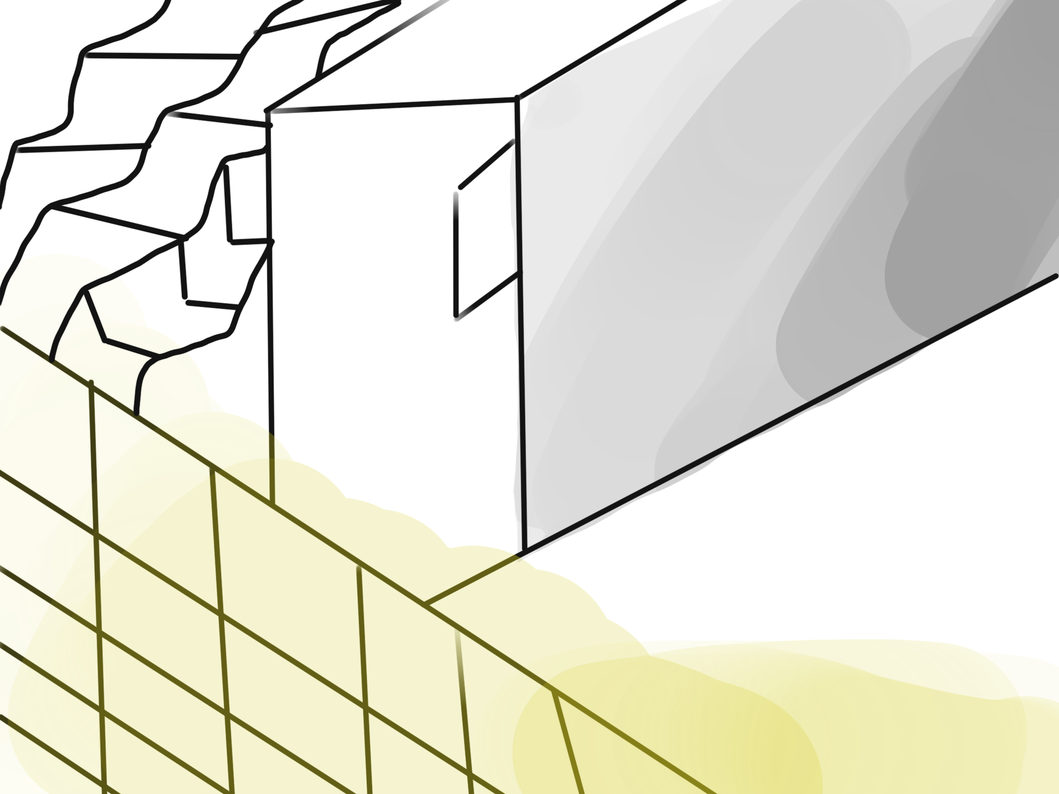
For this design I took inspiration from Bauhaus also, as I used abstract shapes to symbolise the building shape. I used the select tool to change the shape of the corners so that I could drag them around and alter how long the shape could look. I used the eyedropper tool to get the exact shades of blue from the original image, this made the response more cohesive and made it make more sense colour wise.