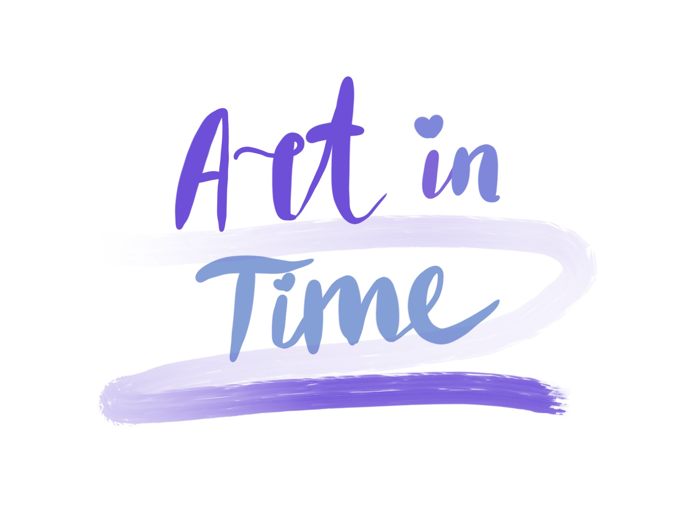
My final decision for the website branding was 'art in time'. I liked this name as i felt it gave my page a nice flow between the old and newer pieces of art work, this could perhaps intrigue the intended audience even more as it would be more interesting to look at both. I did this in blue and purple and in a calligraphic font as I felt it didn't draw too much attention and take the focus away from the actual art on the pages. The name art in time also shows the progression in art over time and how much it has changed without giving the older art a negative connotation of being boring and 'old'.
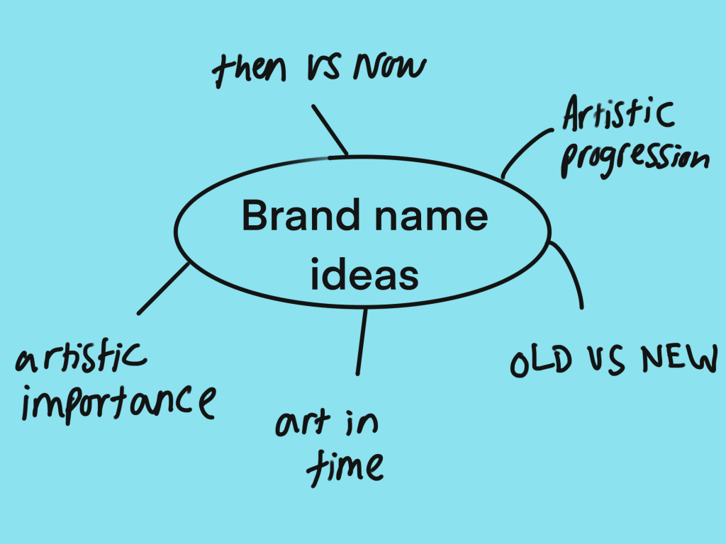
I had trouble thinking of names for my website as I felt there weren't many options for a website that is about old and new art. However I am confident with my idea of 'art in time' as it is not too in your face, but explains to the user automatically what the website is about and doesn't beat around the bushes too much.
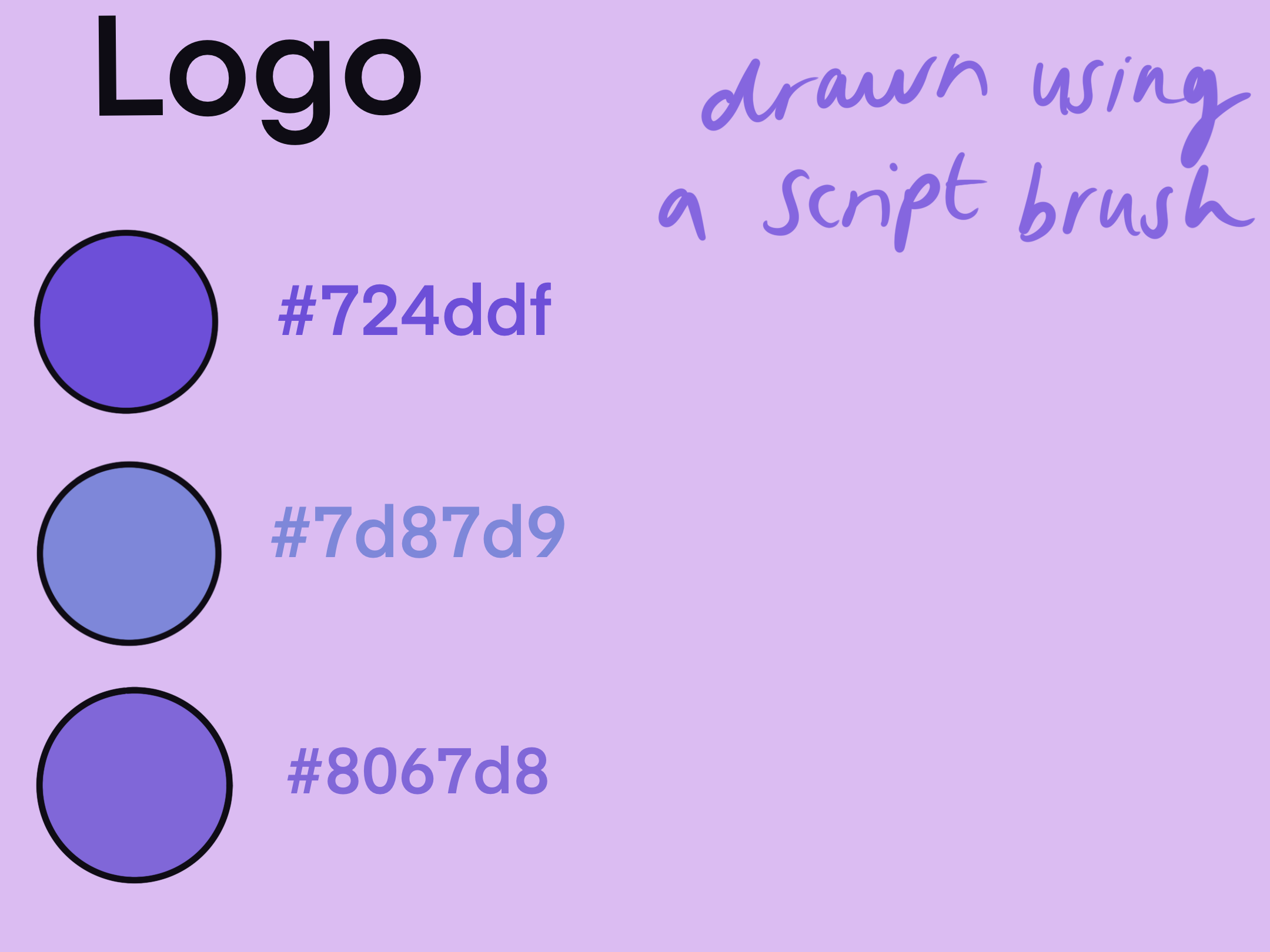
In my logo I used bright and fun colours as I feel as though it makes my target users more likely to keep scrolling through the webpage if it is something that appeals to them. i chose not to use multiple fonts and sizes in my logo as i wanted the idea to be that old and new art flows in the same direction and that although art can be different it comes together as one. I chose to freehand draw the logo using a digital caligraphy brush as i feel as though it is a timeless font, it is something that never gets old or outdated, nor does it take over and look more modern than old. i chose the name 'art in time' as it represents how art gradually and beautifully changes, and that the modern art isn't particularly better or worse, just different. I feel as though 'art in time' fairly symbolises both the old and the new art.
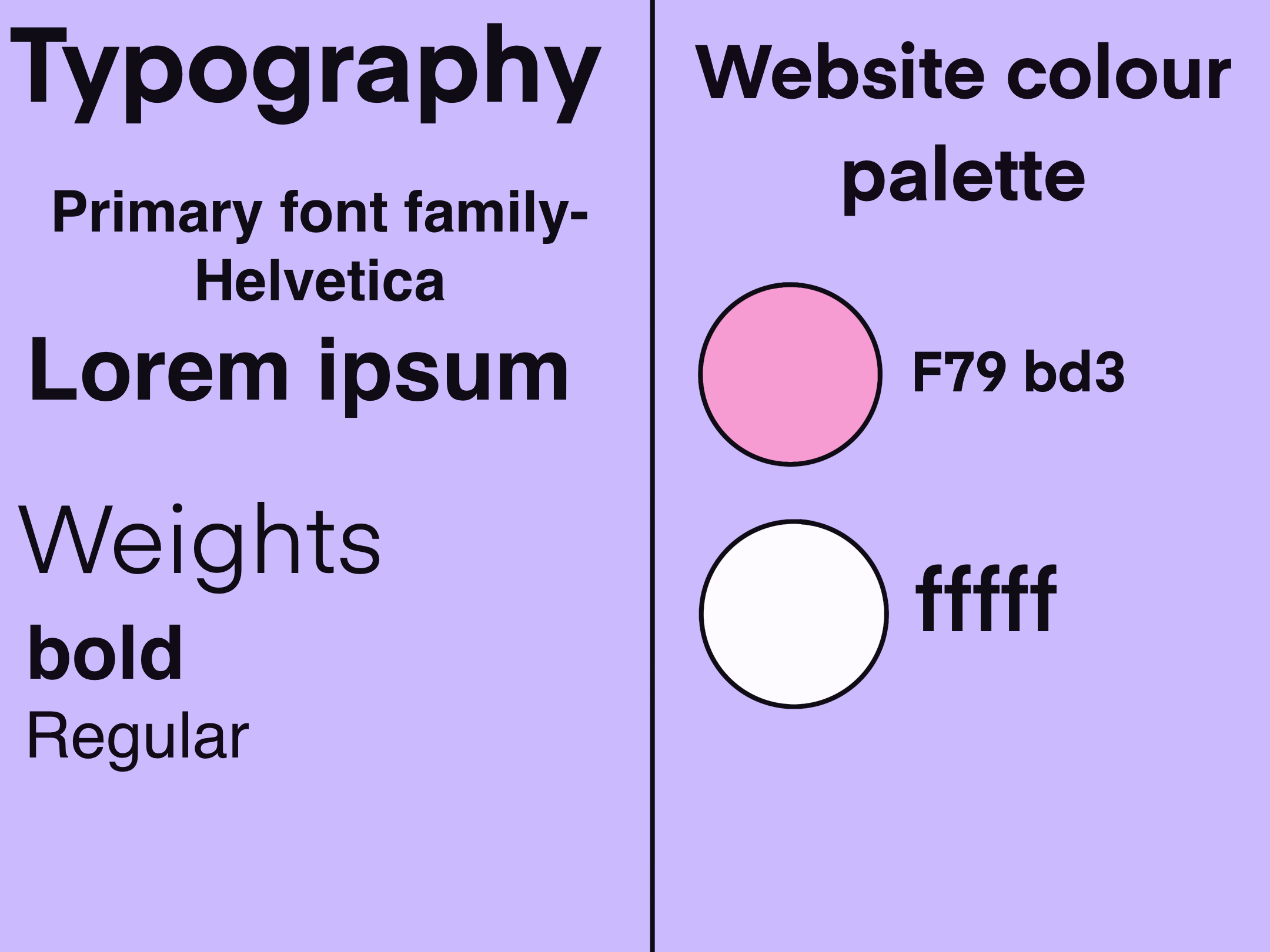
i chose very simple fonts for my website and made sure I kept it all cohesive throughout the entire webpage. Helvetica is a classic font that is not too busy but also not to plain and boring, it is easily readable which is the main reason why i chose it. my colour palette was also extremely simple as i didn't want too much going on and for the colours to take away from the artwork itself, this way the reader has a chance not to get carried away by jazzy graphic and can genuinely take the time to learn from my website.