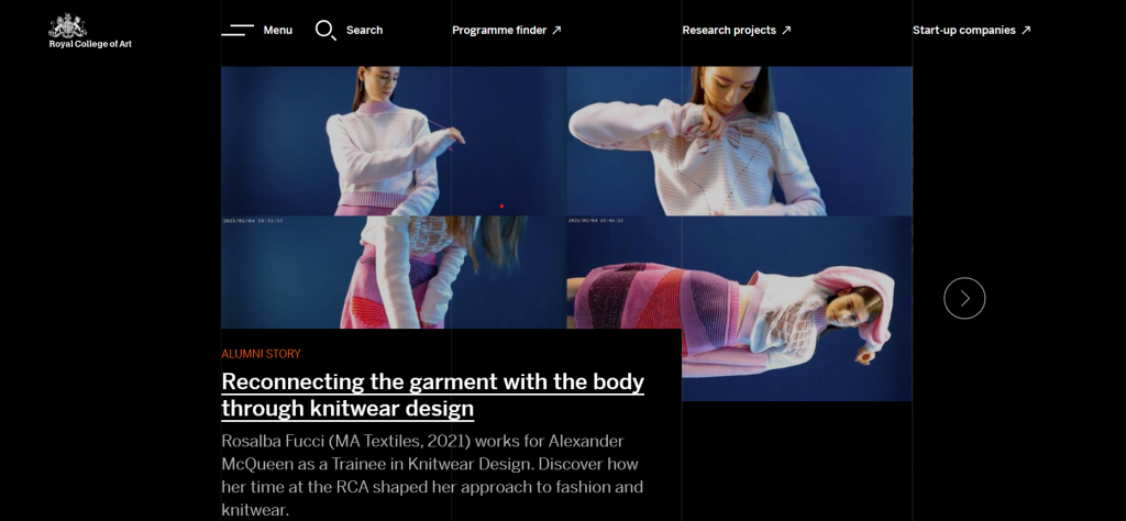
Additionally, the most of the text is placed in the center of the page in a single column, which makes the writing, which is pretty much compressed together, appear less congested. The space around the text also opens up opportunities for adding various components to the side, as they have done here with the detailed sections which would make it easier to move around the page and the website and improve user experience.
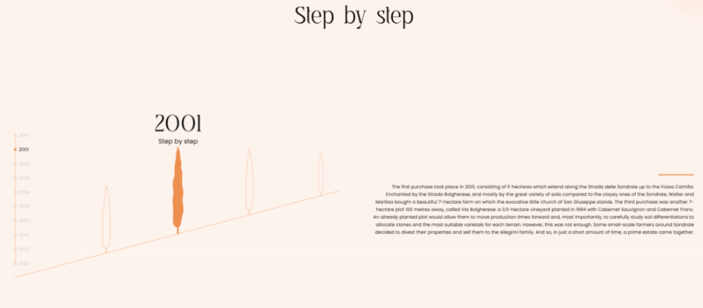
Another timeline example is shown in a unique way. This is an example from the wine company Poggio al Tesoro. In the designing of this, parallax is clearly used, the timeline will stay the same where whilst the information changes and moves. For some people, this can help make the concept of the design easier to understand because the image starts to ascend as well, letting you know that you aren't trapped or stuck in one section of the page.