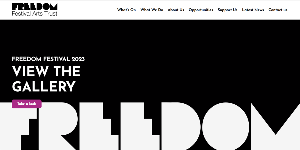
The 2023 version of the freedom festival website has a very modern layout and it has very clear qualities that most modern websites have nowadays. It has all of the usual tabs, such as the social media buttons and the logo is in the left hand corner. The colours in the logo are consistent throughout the entire website and give a mature and grown up feeling as the colour palette is monochrome. Although the design of the page is colorful and unique, I feel as though it does feel slightly serious and unfortunately would not appeal to some adults due to a lack of colours illustrations. The fact that the festival is for arts, expression and liberty in general, they could have been more inclusive to other age groups and made the colours and interactive elements suitable for an older audience too.
Although the website is aesthetically pleasing to the eye, I feel as though if a user was simply browsing and didn't know much about the festival, they would not particularly be drawn towards it and would therefore lack engagement.
Throughout the entire page, the same font family is introduced in different sizes and weights, this makes the page look cohesive and not like its all over the place. Although they wanted to make it simple, I believe they could have used brighter colours without making it look juvenile, as the current webpage looks quite plain and colourless in my opinion.
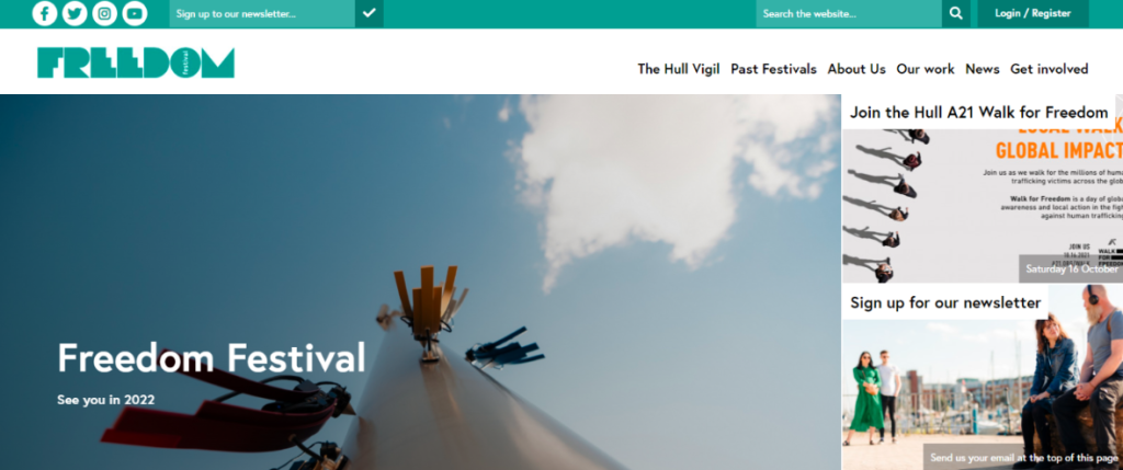
2021
The website only two years ago was not much different however, there was slightly more colour, and the homepage went straight into an image being shown. To me it looks like quite an amateur website and everything is almost placed quite randomly and not thought out or planned. There is visual hierarchy within the text however the fonts used are boring and plain and everything looks quite sparse when placed together, it would have looked better if some of the important information was bold, larger or in a different font. I also think the right hand side looks extremely overcrowded, there are too many things in one area whereas the left hand side is completely empty.
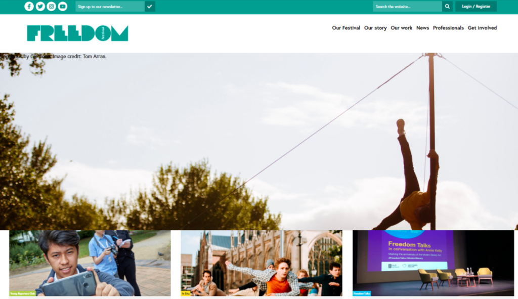
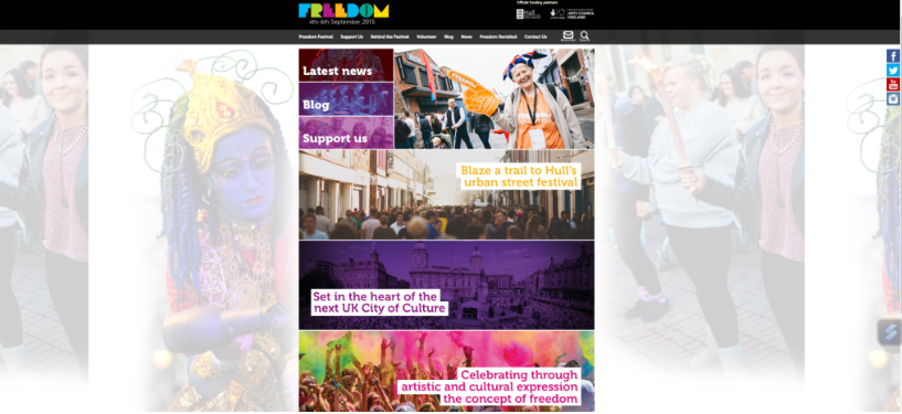
2019
The layout of this webpage changed positively, this is seen in the placement of images as they are changed to be placed at the bottom of the page and center, this makes the page looks more evenly spread rather than just one side more filled than the other. The graphical term for this is hierarchical grid, this is where the rows and columns can all vary in different widths, heights and lengths. Ultimately this grid method is the most lenient and has the least rules on how to lay out a page, anything goes.
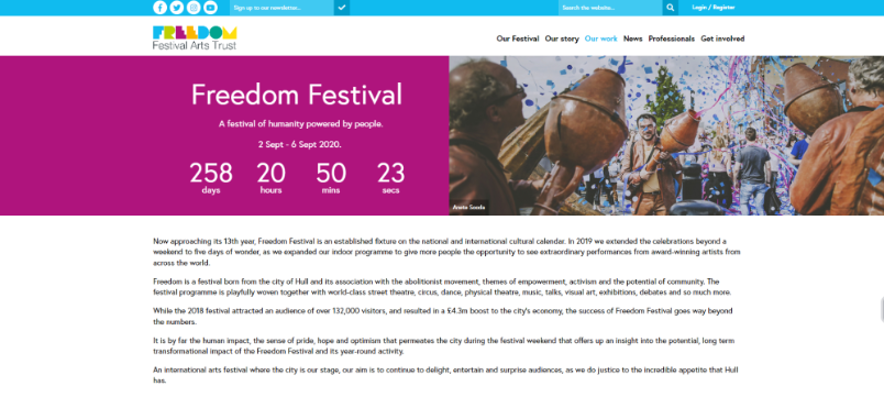
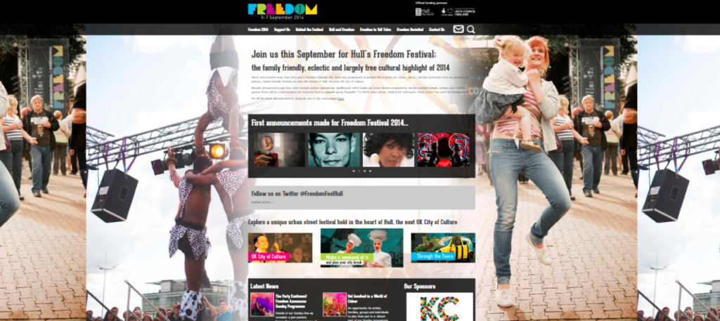
2014/2015
This version of the website is very clearly the most dated, the header has changed from white to black making it look more dark and dingy. The images in the background make it look tacky and unappealing as they clash with the writing, although there is some improvement in the image on the right as the opacity on the images in the background has been turned down and they do not clash as much with the main page and text. Due to the old design of these web pages the presentation seems extremely blocky and narrow as desktops and webpages used to be much smaller and condensed.