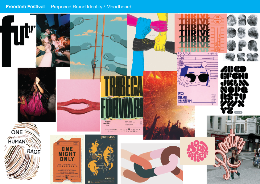
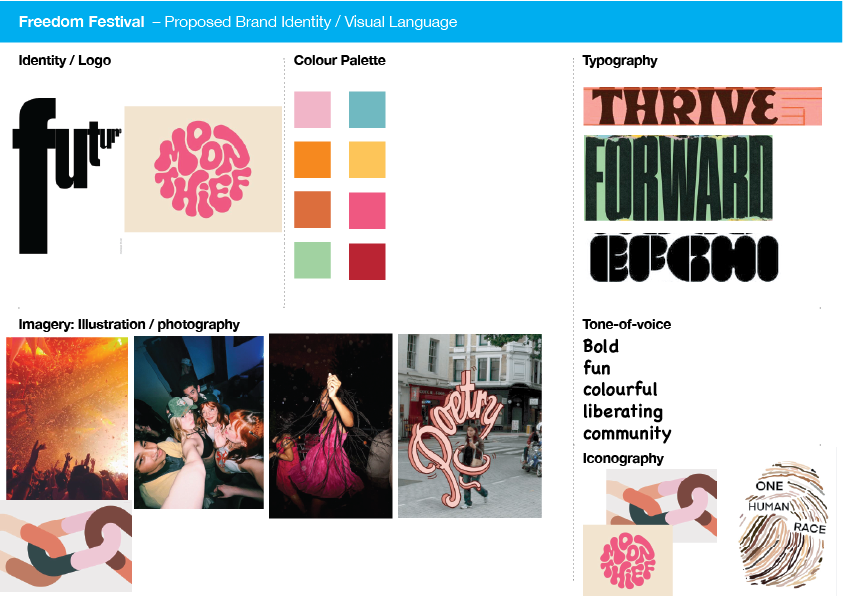
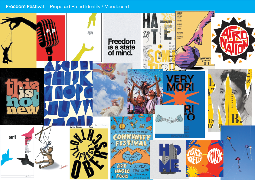
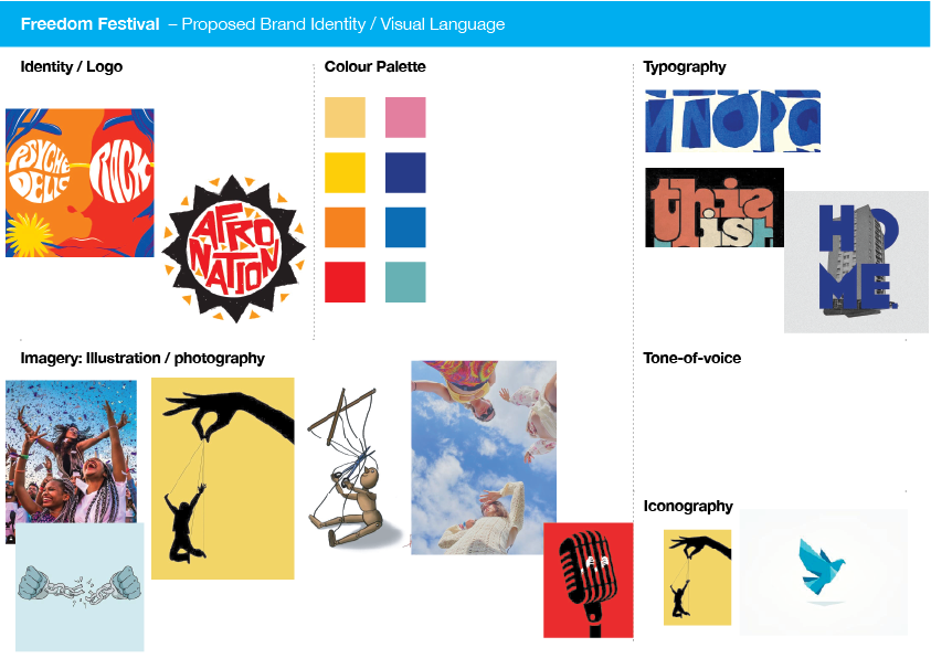
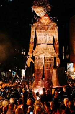
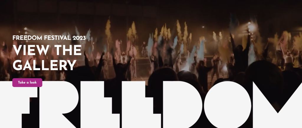
Freedom Festival currently has been designed by Sowden and Sowden and in my opinion needs to be more engaging and interactive, it is not very appealing and looks quite boring especially to the younger audience. The current brand identity doesn't represent the creativity and incredibly mesmirising performances and shows displayed at the festival. It has been a while since the last brand design and I feel as though it could definitely do with a refresh and a new perspective.
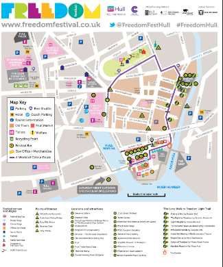
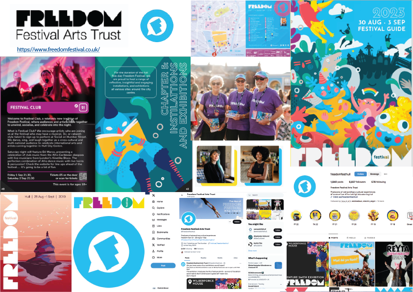
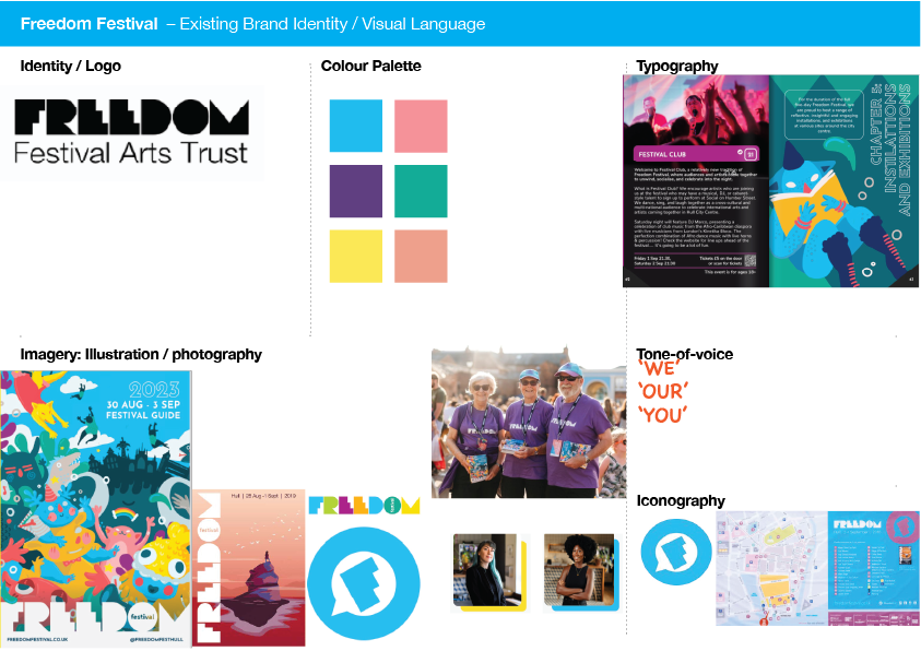
Here I have broken down the brand identity currently, and I have figured out what does not work and what needs to be improved on. I feel as though the brand needs something specific to the brand itself as an icon/logo. Their tone of voice is inclusive and feels very welcoming, as hull has a very diverse community with many different backgrounds and cultures.
