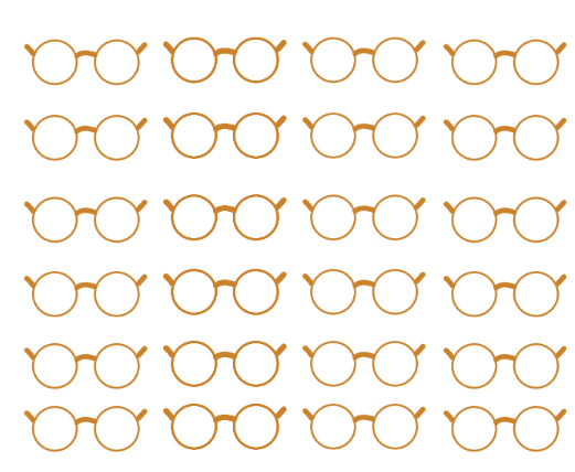
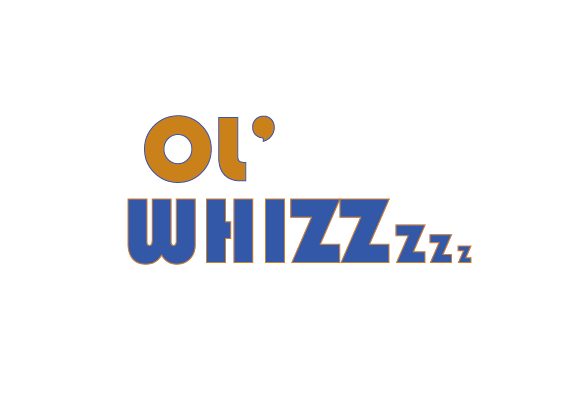
For my conceptual logo I wanted to give the impression of something old which would not be hidden and would automatically be associated with old people. I came to the conclusion after trying multiple variations of prints that I wanted a glasses print that would run throughout the entire package design label rather than just one small logo. I wanted my logo to cover the entire can to draw attention and appeal to the target audience, as old people generally have bad eyesight so need to be able to see my drink package from far away. I used colours that made me thing of old people like oranges and purples however I began with using yellow and found it to be too subtle and not eye-catching enough. another reason for the orange is because i decided the flavour of my energy drink would replicate that of ginger beer I personally know this is a fan favourite when it comes to the older generation as my grandma herself stocks up on this constantly. Ginger is also known for being a natural medicine and an ingredient in alot of herbal remedies, therefore making this both nutritional and appealing to their tastebuds.
For my font section of my logo I wanted to incorporate the world "ol" as it is known as the older generation's slang, typically said in a cockney accent. I chose this as it fit my somewhat casual vibe for my drink design and found it to roll off the tongue quite smoothly without have to force something unnatural. I decided to include the word whizz as I came to the realization that I wanted my company to be a monthly subscription and delivery service, this is because older people usually forget to continuously buy things that they need and also due to their disabilities where they are not physically mobile. No one will be left out and everyone will get a taste of ol'whizz.