Incorporating principles of UI/UX design and user-friendly interfaces with Adobe XD
Usability is one of the main goals of UX design. Users must be able to easily move through and understand your UI. Your user interface must be both effective and entertaining, giving the user a positive experience and desired outcome.
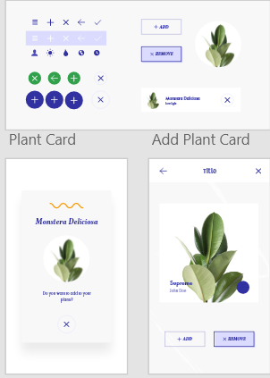
You may make components for your designs with Adobe XD. Components are reusable parts that can be saved into libraries and used again in projects. Examples of components are buttons, lines, icons, and shapes. Any asset in your document can be made into a component using a feature included in the XD software.
Everything you've created can be accessed through the library panel at the bottom left of the page, which contains all the components you've created, when you right-click on it and select "Make component." For even easier organisation, you can rename each of these components to further avoid clutter and organise them into distinct categories within the library.
The user can effectively swap buttons and icons by nesting components inside of one another, saving them from needing to be changed as a whole. If you would like to replace the cross icon with a different one, you can locate your assets in the component panel and scroll until you find one that works. The cross itself can be highlighted independently of the remainder of the circle behind it by first duplicating the entire component many times and then clicking across the group.
Buttons
In many designs of websites and applications, buttons are a popular element. They are interactive and let the user do a lot of things, such store their preferences, discover more information, and navigate across to new pages. Because they encourage interaction and action from the user, they can also be called "call to actions" and give guidance to the user. Size also plays a crucial role in button design for websites and mobile applications. Large buttons are necessary for easy user clicks, particularly on mobile devices where users would be pressing them with their fingers.
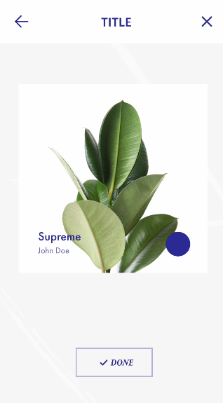
Using States
Through the "States" tool in XD, users may design and build interactive content that adds to a seamless and enjoyable user experience. We can store numerous versions of the component thanks to the various states, which enables us to change particular buttons and navigation settings to provide a more dynamic overall experience for the user when they click through the prototype. You can add one hover state, which I've included to the tutorial here, when adding states to a component. After I have the new hover state open, I can modify the button's background fill to make the display colour change along with the button when you hover over it in preview. Then, to show that the button-pressing operation had concluded, I added a third state and modified it to read "Done." The procedure was made much simpler because I didn't have to develop new states for each component that was involved because I could also modify the icon with it.
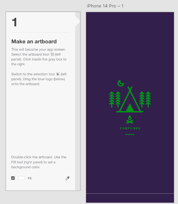
The "Campvibes" exercise was our first attempt at a UI/UX exercise that was centred around user-friendliness. First, a new artboard for the app screen is created. The logo was positioned in the centre of the page, and the background colour was then altered. Technically speaking, this was a relatively straightforward assignment, requiring most of the attention to be put into choosing a suitable colour scheme for the page (I went with purple because it seems appropriate for a night time camping trip).
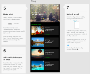
Our next task was to make a list that we could navigate through. I was able to construct numerous articles for the first time by using a repeat grid in a more practical approach. To get the ideal size gap, I was also able to play around with how far apart they were. To give the impression that it had numerous distinct articles, we also used this as the first instance of using the ability to drop multiple photos into multiple boxes at once. More technical skill than creativity was required for this one in order to place the images and make advantage of the repeating grids.
The colour scheme used throughout all the pages was one additional creative element that was covered in this. We were to change the accent colour from blue to green using the website's colour customisation feature, which I discussed in the previous section. However, I didn't like the shade of green that was assigned to us, so I chose a slightly darker shade that I felt better complemented the site's design.
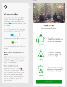
An additional exercise used components. Changing the master component's headers was the first section's task. Here, I experimented with many header styles. The most simple header, aside from a plain white header, was a solid colour header. In this case, all that was required was selecting a shade that went well with the rest of the design. A blur was produced by the second header style in front of the page's hero image. The fact that I had to add a background blur to the rectangle I made for the header and change the parameters to produce the right amount of blur with enough light passing through made this a little more complex. Here, too, I played around with where the text should go in the header.
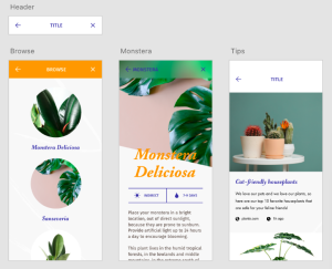
The last part of the exercise involved creating state components. In this case, I had to choose the visual elements for the hover and toggled states. For the hover state, I went with a light purple colour, matching the rest of the icons. For the toggle state, I could have created a colour that was mostly purple with white text, which would have been the opposite of the original state.