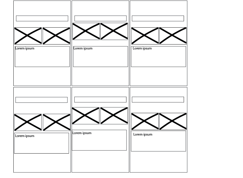
This was the wireframe I ended up using for my website. I created this low fidelity wireframe myself using adobe illustrator. i made my layout fairly simple and uniform to each page, there are not many changes as i wanted the users to fully experience the art on the page and not be overwhelmed by different layouts and fancy graphics. I like how all of the information can be read by simply scrolling down, i experimented with other elements however i found them to be confusing as the user could click on a button to play around with the website and end up being taken to a point on the website that they didn't want to.
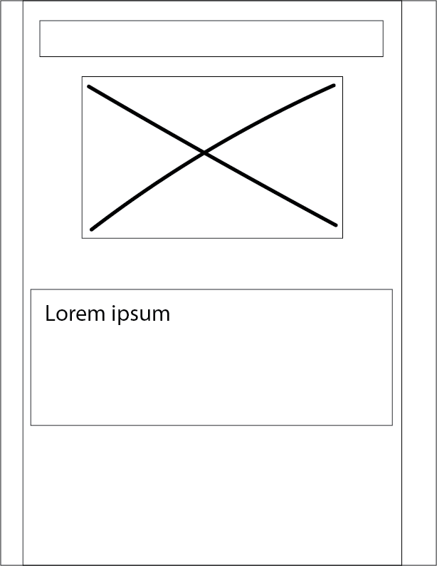
This was my rejected wireframe and the layout I was originally going to have for my website. however I decided that as the user was already going to be scrolling through the web page, this would have caused them to get bored and also perhaps a little confused as the old artwork and the responses wouldn't have been next to each other, so it could have looked slightly odd. Because of this i decided to change it to the layout above, where I have each piece of art work and its response next to each other side by side.