Web and app design play a crucial role in promoting cultural events by helping brands and event organizers reach a much wider audience to be able to provide a seamless user experience. The world is constantly changing and improving digitally and it is important that brands are able to keep up and move with the times in order to 'fit in' with the latest trends and modern design.
User experience (UX) and user interface (UI) are crucial in design for ensuring that visitors can navigate the website or app effortlessly. Easy navigation, clear and concise content , and responsive design elements can hugely improve a user's experience, making it more likely that visitors will explore the event further whilst enjoying the design.
Brand Identity and Creativity
Brand identity can be hard to determine and this goes hand in hand with fostering creativity, one way this can be done by essentially using multiple materials and using multiple sources to gain inspiration and to see what is popular and trending online and within the community. It is important to use a wide range of promotional techniques to gain a more varied audience and so that the event will reach different genres of people.
A USP (unique selling point) is essential in ensuring that your audience is able to associate a certain thing with your brand, this will make sure that you stand out and do not blend in with other brands who may have similar promotional techniques.
The most popular form of promotion is social media and this is because in this day and age most age groups, old, young and everyone in between are on some form of social media and the algorithm is the easiest and most effective way to get your brand across to your desired audience.
Examples for a unique selling point could be anything from a specific colour formula, or a certain font or size of font that could be used on billboards and multiple promotions.
Notting Hill Carnival
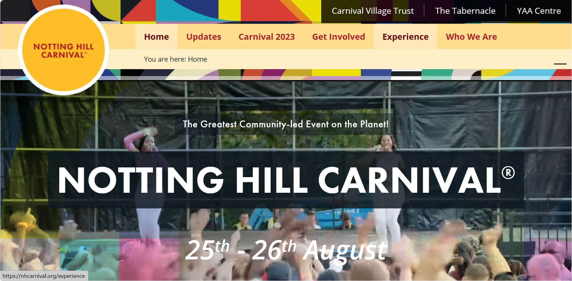
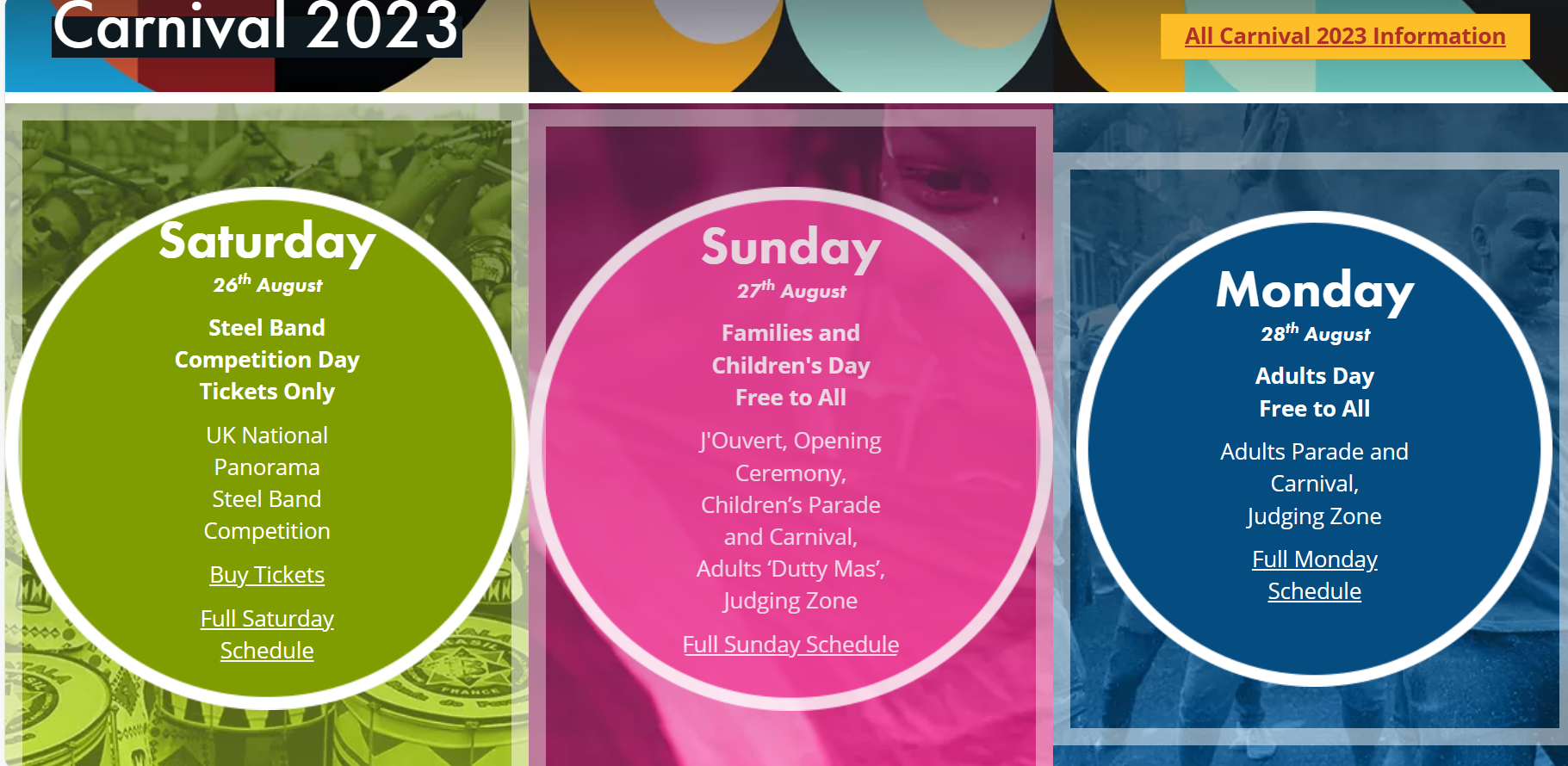
Notting Hill Carnival is an annual cultural event which represents the Caribbean culture and has been taking place ever since 1966. It is one of the worlds largest street festivals making it an important time of year for those who look forward to celebrating and taking part in the festivities. The website is extremely simple and easy to navigate, it is not complex and has simple and easy to read buttons. It also clearly states the dates on which the festival takes place and who may attend each day, for example they dedicate a day to families and children as the adult only day can be explicit and involves drinking and dancing. This is most probably what most people go on the website for to begin with as they want to find out where, when and who is able to attend.
Overall I like the idea of it being simple when first clicking onto the website, however I feel as though they could have been more innovative with the colour palette and the type to match the extravagant images and to catch the consumer's eye.
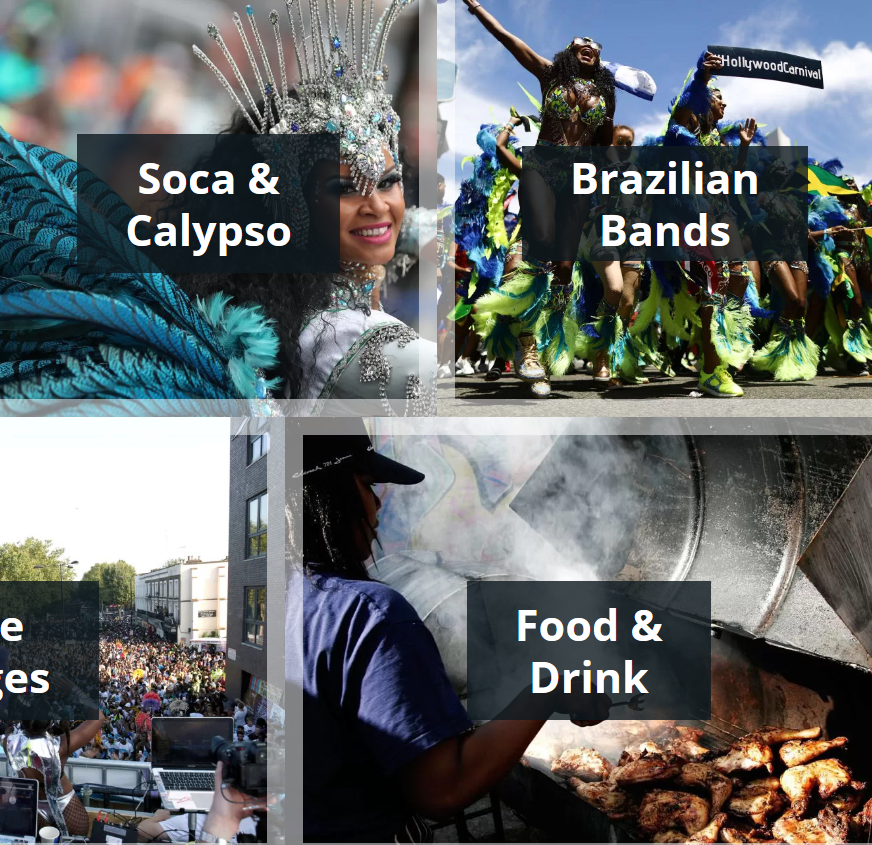
The website uses a card layout, everything is blatantly in front of you and very clear. They include things that they know their audience would be interested in like food and drink, and bands that will be playing. Although there are no videos or animations throughout the website, I think it works well as it is simple information that is being conveyed clearly and it gets straight to the point without going all in with the graphics.
The text is all clear, with it being large bold white type, although I do think they could have been more creative with colours and styles of type, although it is clear it doesn't give a festival vibe and almost makes it feel like you've clicked on a regular website.
Although they use colorful images , the background and colours used on the page clash and can make it feel like there is too much going on on one page. Personally I would have used a simple yet bright colour for the background rather than some of the pastels and muted colours. A Caribbean blue and bright oranges and pinks would pair well with the colorful dresses and the extravagant costumes giving it that carnival feel.
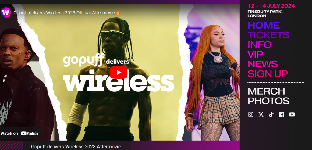
Wireless Festival
Wireless is a music festival that happens annually and specifically revolves around pop and hip hop as well as other genres.
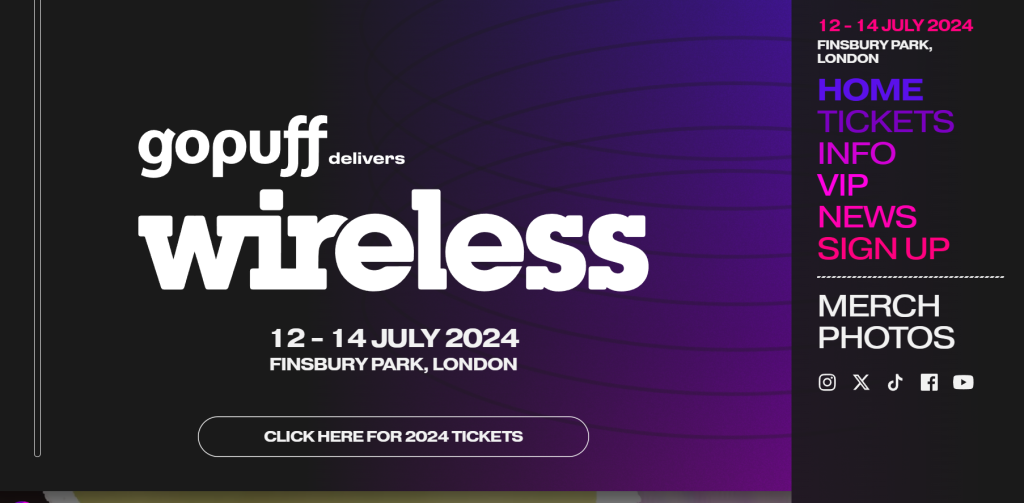
The layout of this website is abstract but it works well as the most important information is on the left hand side. It has the date in the top right corner which is the most important information and would be useful for the user. It also has the location and a menu below it in bright colours. The mix of type and fonts go with the vibe of a music festival and give a musical feel and the large white sans serif font in the center is good for the user experience as they wont get confused when they click onto the website.