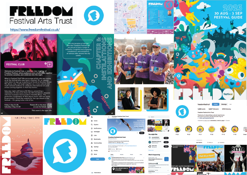
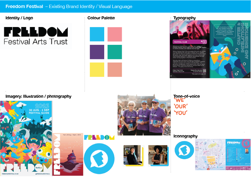
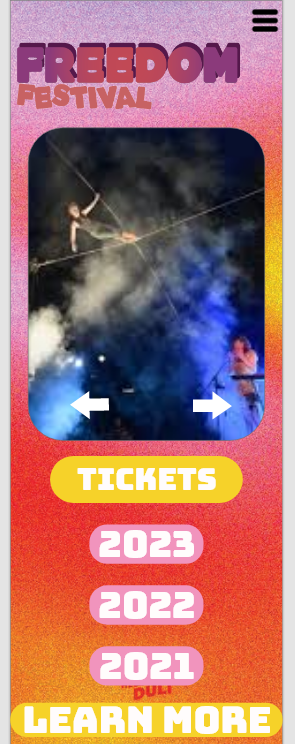
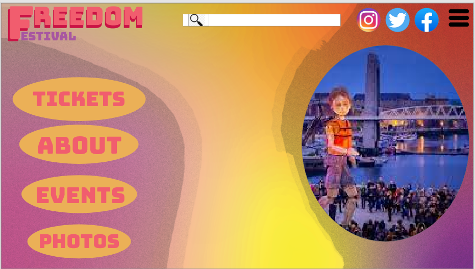
The current Freedom Festival colour palette and style consists of bright and fun colours which gives the whole brand a playfulness, this caught my attention as I enjoyed looking at the graphics and the hand drawn illustrations. The multi channel media however such as the posters and advertisements give more of a youthful feel with the cartoon looking illustrations and the types of characters that young children would often find in cartoons and children's books. This does not seem like it would particularly appeal to adults and most of the older generation. The mascots and cartoon characters give no resemblance to the art and skills that are shown throughout the freedom festival therefore I feel like it is almost misleading to the audience. The original logo also seems very basic with a plain sans serif font that does not seem to hold any ideas or inspiration to do with the meaning behind the freedom festival.
My Moodboards And Breakdowns
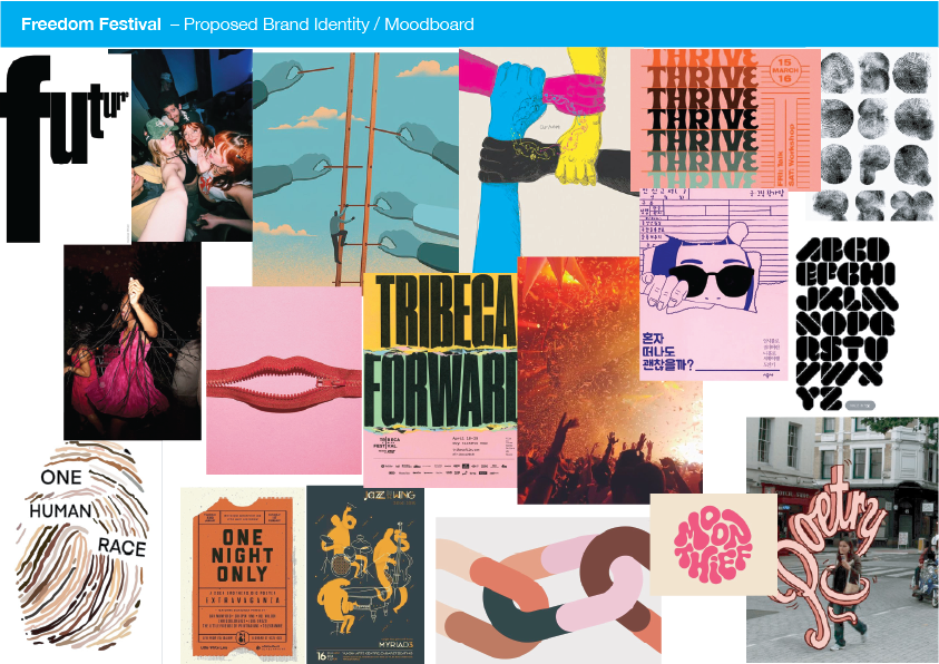
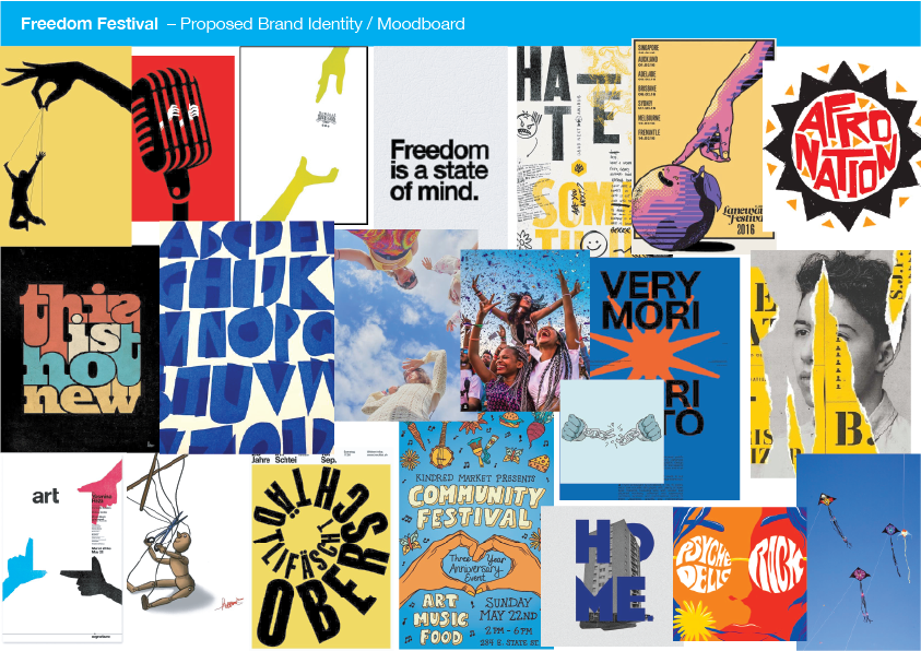
My plan for my mood boards was to move in the direction of creativity and have everything have a meaning behind it, the colours and images I have chosen show freedom and liberty whilst being colorful but without the childishness, I feel as though different shades of the same colour can give completely different perceptions to a person, and more muted colours will appeal to adults and people who can appreciate the art of the festival. However I can admit that the colours in my first mood board above do not mesh as well together as I aimed for them to, for this reason I made another mood board .
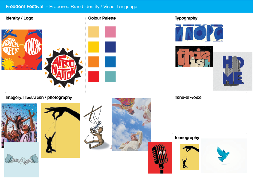
I wanted this mood board to more blue and yellow colours as these appealed to me the most when I was exploring the concept of freedom. I also explored the fonts that can be seen on the mood board and these will be included in my final design, this is because the hand drawn imperfect letters i think are what truly show the freedom festival for what it is. I continued to keep some bright colours whilst taking out the childish drawings and I felt them unnecessary.
Final Moodboard Design
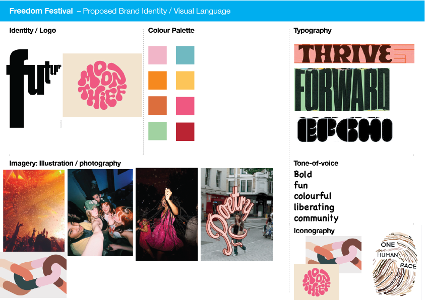
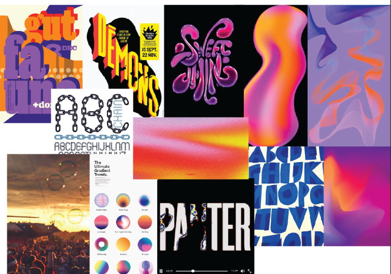
My Final mood board consists of an 'aura' feel, I want users to feel free and relaxed yet intrigued when looking at the freedom festival website. The typography I included are quite different from each other but I will experiment and play around with the different fonts, perhaps even merge them to make a new font. To make my mood board feel more like the festival I have added sunset images of people at festivals with bubbles blowing in the air.
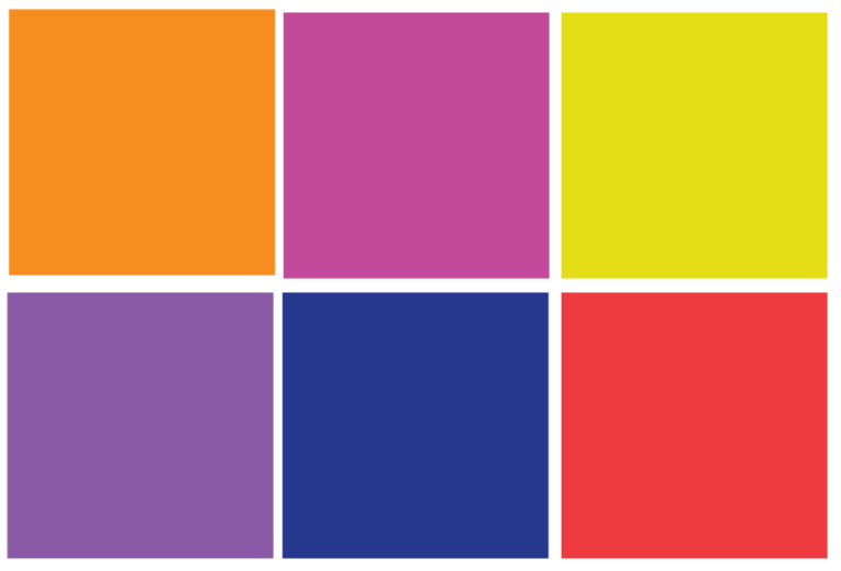
Colour pallette for my final moodboard
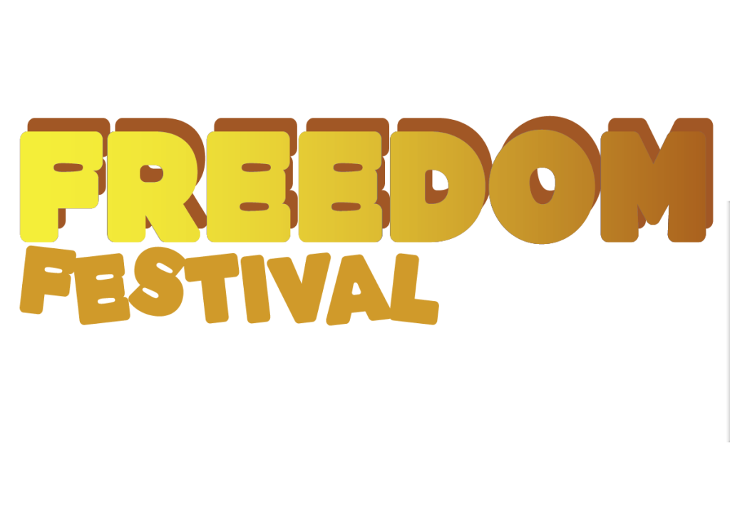
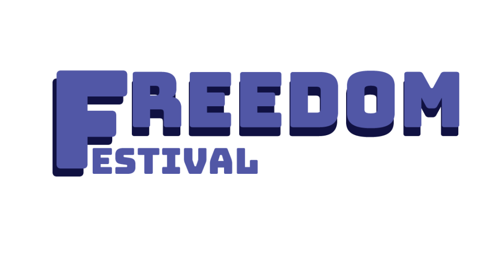
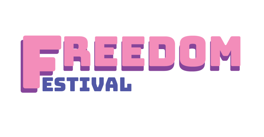
These are some rough fonts that I have not played around with yet and I was simply testing out colours to see which would work the best and I have decided on a pink and yellow gradient as the colour scheme for the font.