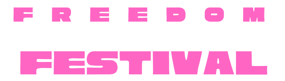
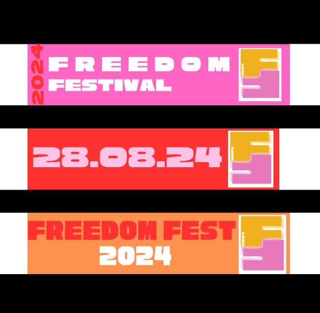
This was my original font decision for the heading and logo however i changed it as I feel like it might look slightly outdated and not as refreshed as i had hoped for. I then decided to change the logo out for something more colourful and sleek as I felt this matched the vibe of the festival more. Since there is alliteration in the name of the festival I chose to take both f's and join them to create the icon logo, One version has the year 2024 written inside of it, the reason for this is because I could not decide whether it was necessary or not and whether it looked over cluttered.
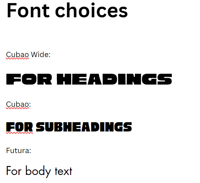
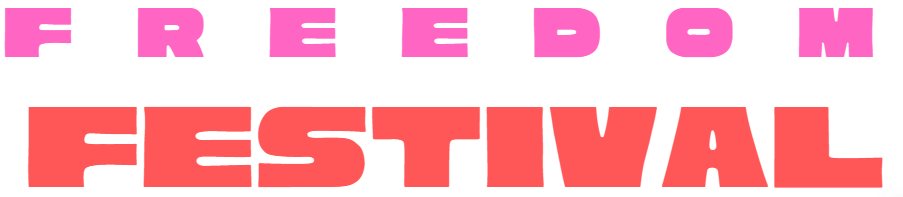
For the actual logo, I finally decided on the cubao wide font, I liked the look of this font as it had the fun feel to it from the rounder and irregular edges, but it still seemed uniform which seemed appropriate for an event such as the freedom festival, I also decided to add some spacing between the letters of 'freedom' as It almost gives the logo freedom in itself. It adds some depth to the words which, in my opinion, seems more fun and quirky. Text works best when it is utilised in headings and brief sentences because it is too small to be readable in smaller spaces. The reason for selecting the various Futura variants is that, out of all the fonts I could discover, Futura is the most geometric; that is, each letter has the same line thickness throughout. It was therefore consistent with the brand's overall identity and aesthetic. In my opinion, I've struck a good balance between the three versions so that they still look sleek and contemporary while yet having a striking, impacting look. Almost all web and advertising designs have text as a primary element. The font is intentionally created to make it instantly recognised to Hull residents as the one used for the Freedom Festival. Even if they were to see it for the first time, without any logos or any context, they would still associate it with the event.
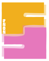
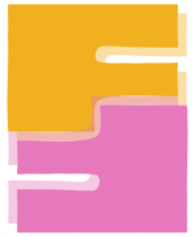
The colours I have chosen for my brand identity are not so much childish, but they are instead freeing and fun, they give a relaxed and boho feel to the entire website rather than it being very monochrome and neutral which does not appeal to viewers at all. The Freedom Festival's primary goal is to create a warm, welcoming environment for everyone, and I think this helps achieve it by making the brand feel very approachable to everyone. A strong brand identity can also be created with the colour palette as one of its key components. Pink and orange, which are not too different from from the current Freedom Festival's colour scheme, are my primary colours. For individuals who have gotten used to the previous branding, this enables the creation of a link between the old and the new.
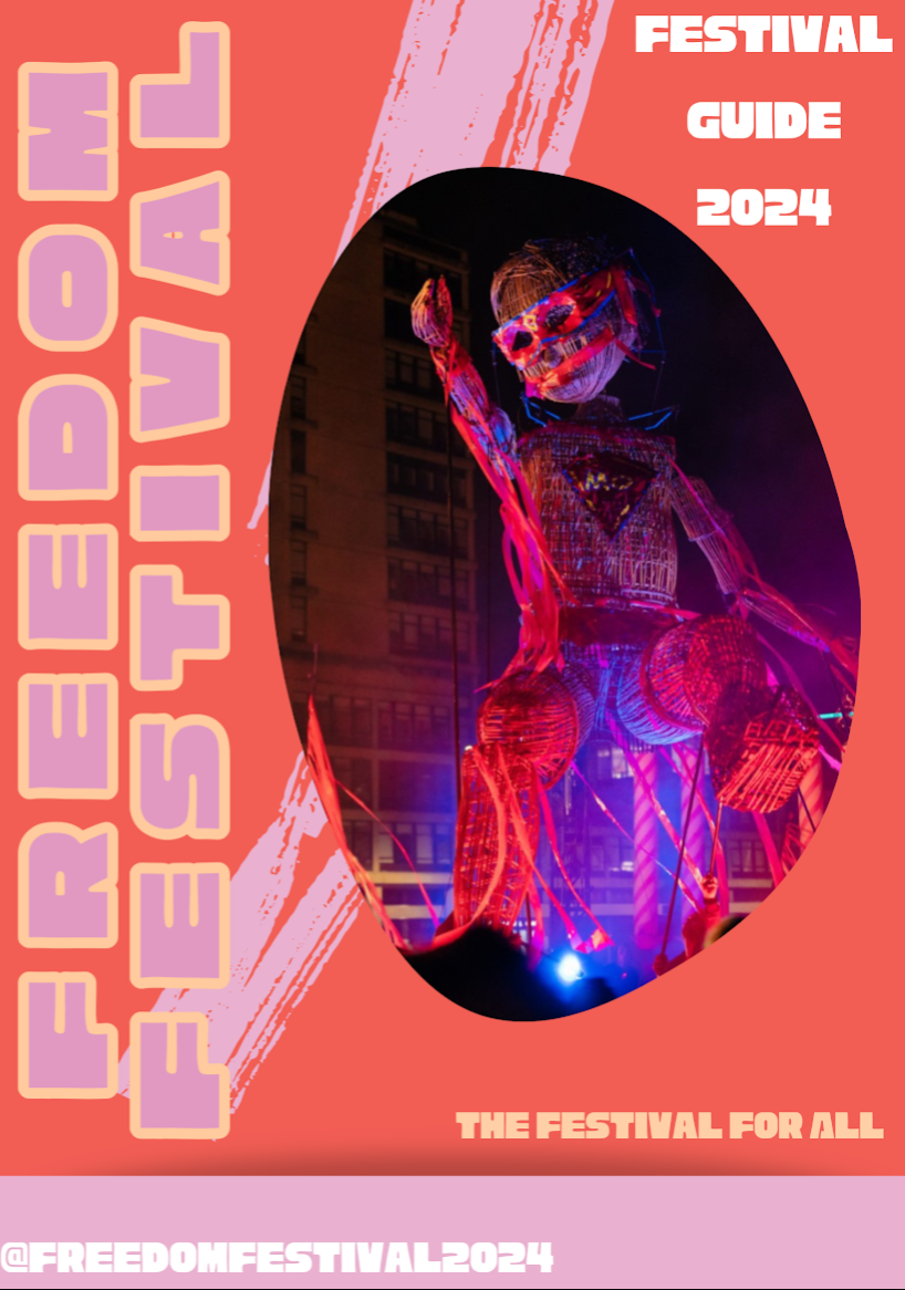
Front page to festival guide brochure
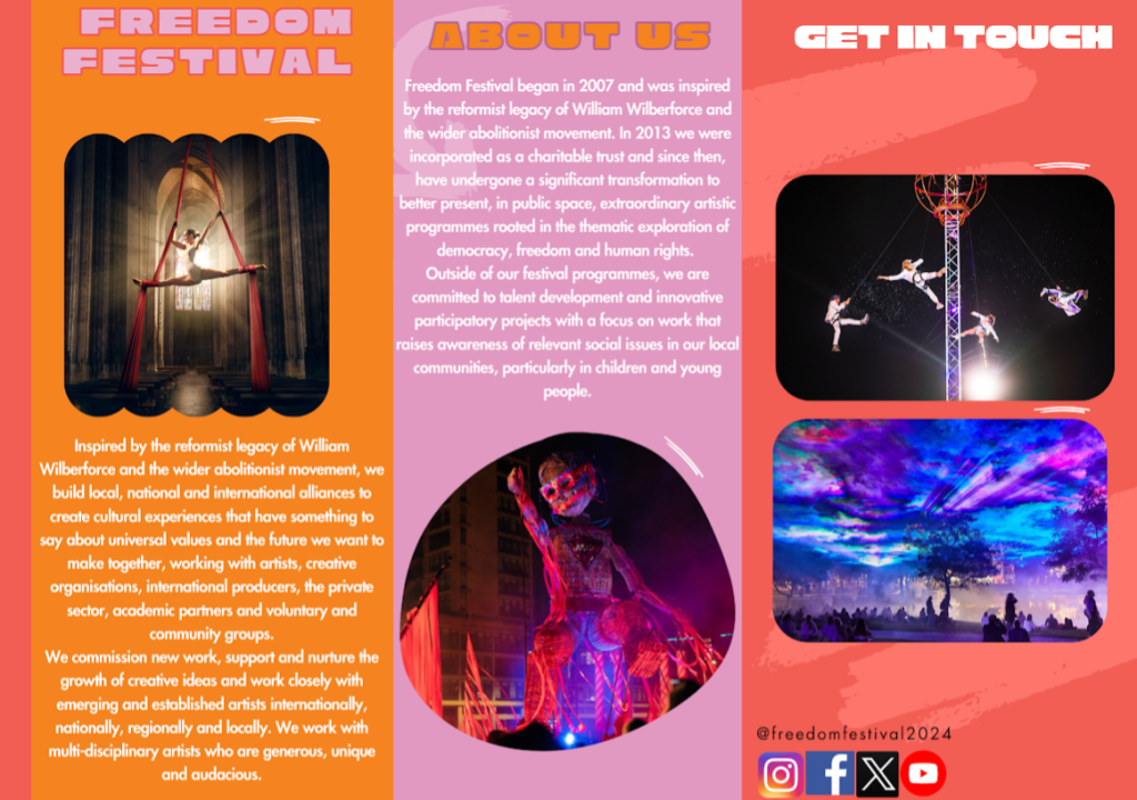
Festival guide brochure
The opening page of the brochure briefly explains what the freedom festival is and some of its history, I have used bright colours once again to tie everything in and to link it in to the website as it will be recognizable to viewers automatically and they will know what the brochure is for. On the last page I have put the contact details with GET IN TOUCH in large letters so that it is easier for viewers to see as they finish reading the guide.
For a business, social media and email marketing are essential since they let the brand reach a larger audience that might not have otherwise discovered the event. Since many things have moved online, it makes sense for advertisements to target a younger generation that is growing with technology and is more likely to get it. Standard advertisements may draw in an older, less technologically inclined generation due to their importance in previous years. Successful online marketing can also involve the employment of internet celebrities to support and promote events to their followers. This makes the event seem more real and credible to the public because the brand isn't the one promoting it.
Due to the constant flood of content that audiences receive via social media platforms and the rapid evolution of media trends, attention spans have significantly decreased in recent years. As a result, long-form advertisements that are meant to attract brand-new consumers who aren't familiar with the company are losing their effectiveness because so many people would ignore them right away or have ad-blockers that prevent them from ever viewing the advertisements as they view them as useless all together.
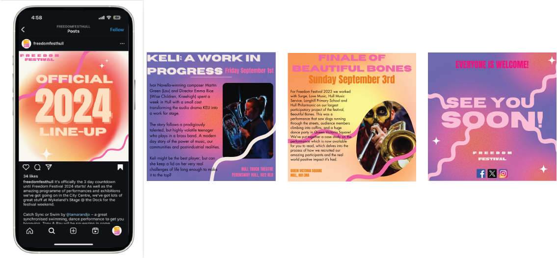
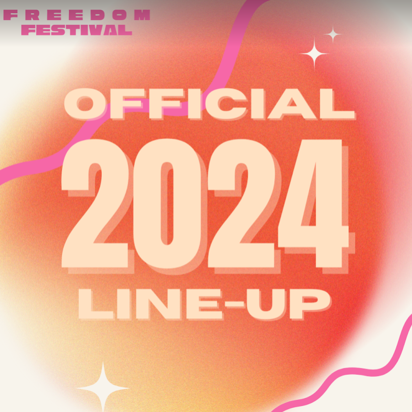
Instagram carousel for 2024 line-up
The updated social media accounts and the posts that go along with them are shown in the following samples. I made a slideshow of pictures for the Instagram account that would show a day of the event, giving viewers an idea of what to expect. It appears more unified and consistent with the rest of the brand because, while scrolling across, the aura effect I utilised makes it appear like one long strip rather than a collection of disconnected photos. Compared to Instagram, which is more focused on visuals, Twitter is typically a place for more text-based material, thus this is where most serious update updates would go. Instagram carousels are extremely popular nowadays and appeal to alot of young people as they are intrigued to see what comes next, nine times out of ten they will stop to check what comes after the front page, especially if the front slide is alluring and bright in colour such as mine.
Digital advertisements provide you with an area to work with in order to establish the voice and image of your brand and how you want the audience feel about your business. Users may perceive you as more genuine as a result, and you may even develop an indirect connection with them in which they believe they are familiar with the brand management directly.
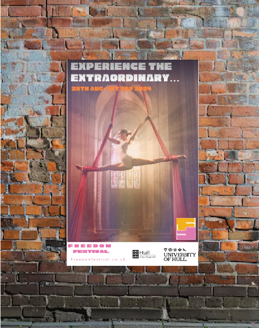
One of the ways I would use physical advertisements would be the pasting of posters around the university and high street shops, here is an example of what that would look like. I turned down the opacity on the image I pulled from the freedom festival website in order for me to be able to layer the text on top, this makes the poster flow smoother and mesh together well rather than images and text being on separate panels. The colour palette I chose to focus on blends really well with the images as there are alot of warmer colours such as pinks and oranges. It also attracts the light which gives the effect of light emitting off of it, this drawers people in so they are more likely to stop and actually take the time to read the poster.
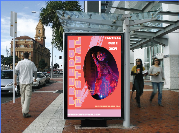
I would put viral posters on bus stop billboards, as seen in the mockup above, as one method of using physical advertisements. In order to create the illusion of changing visuals, the bus stop variants would use a three-way screen design. The main screen would display the original pink slide with the front page of the brochure on it, this makes it clear that there is some type of event happening. The side panels of the bus stop would then display the updated design version that would appear as you approach the bus stop or as someone walks past it. Additionally, this advertisement might be shown digitally at malls with digital billboards like St. Stephens. Because of the aura effect I have incorporated into my website, the gradient could move the closer the viewer gets to the screen, this would make for an extremely fun and slightly interactive billboard experience. It immediately sets the tone for what the festival will feel like.
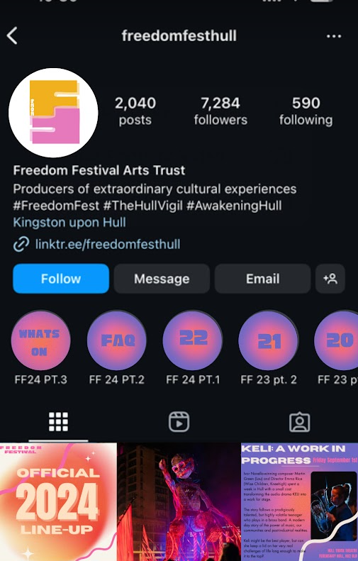
instagram page mockup for the freedom festival
This is an instagram page mockup I created myself using the original freedom festival page as a reference. I implemented my own logo and highlight cover pages so that it matches with my refreshed brand identity.
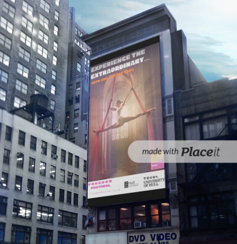
In order to complete the print advertising, I designed a static billboard that would be displayed throughout the city. The Freedom Festival uses the language on this billboard to encourage people, spread the word about the event throughout the city, and increase excitement for it. This is unforgettable and recognisable, in my opinion, because of their straightforward design.
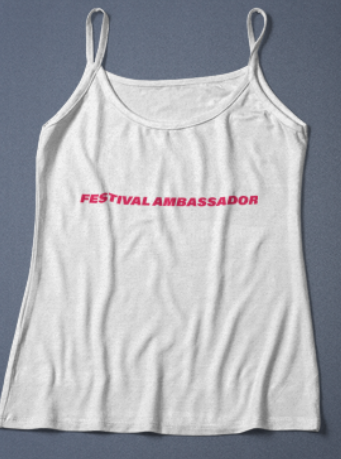
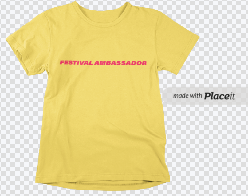
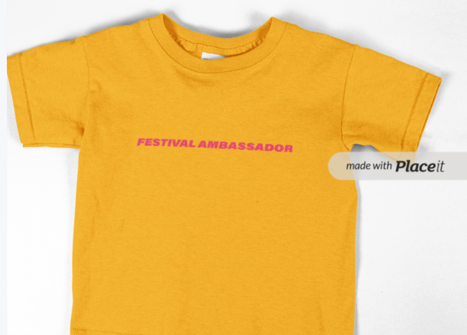
In order to give the goods a little bit more personality and variation I used the colours that are used throughout the website. Additionally, they would be printed on non-wearable objects like mugs, water bottles, keychains, patches, and other apparel like jumpers and hoodies. The Adobe software gave me some technical difficulties, so I had to use a separate website to produce the t-shirt mockups. Nevertheless, I was still able to obtain a general sense of what my products will look like with my text attached. I wanted to use brighter colours so that it isnt seen as a uniform but actually seen as merchandise that people would want to purchase. I also incorporated a vest top version as the weather is warm during the time of the festival and I wanted to give people the option of more or less coverage.
wrist band mockups created by me
In order to simplify the ticketing procedure, I wanted to design an imaginative piece that would not only physically let you enter the event, but also serve as a means of identifying the exact ticket you purchased with a simple wrist scan to performers or vendors who might be constrained by time or age limitations. Also, these wrist bands could specify the date on which you attended the festival, this would help sellers to pinpoint who is trying to get in with the same ticket on more than one occasion.