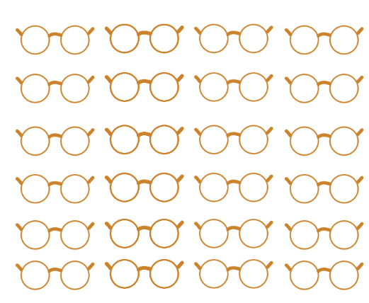
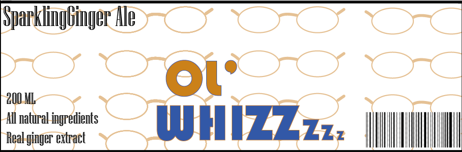
This glasses print is my background design for my can which will be covering the entire packaging design.
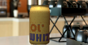
For my first package design I wanted it to be very simple but for it to have all of the main components needed to persuade a customer that this product is worth the buy. I understand that by using such a niche flavor there is always a risk that it might not be very popular, however I believe that instead it will attract customers from other ginger tasting drinks as this one is genuinely beneficial for their old age and their health, it will attract a certain kind of audience which is exactly what my goal is for this project. Due to the target age group I also decided to lean towards a more 80's style feel and design with both the fonts and the layout of my label.