
This is my first conceptually designed personal logo. I started by using my initials, IA, I then wanted to incorporate one of my hobbies, in this case it was the gym so I decided to add a barbell with some weights and place it on top of the letters. The font I used to create this logo is Ariel Rounded MT Bold. I used this font as I felt it was the best suited for my logo. The roundness of the letters blended perfectly with the barbell and the weight, as it gave almost a bubble letter effect. The reason I used oranges and reds is because these are my favorite colours, and these are the colours I mostly wear to the gym. To layer the letters together I had to create two separate i’s, this is because I kept the burgundy outline on the top layer and I sent the orange layer to the back. I wanted to give off a fun and colorful yet clear and abstract vibe from this logo and I feel as though I achieved this fairly accurately.
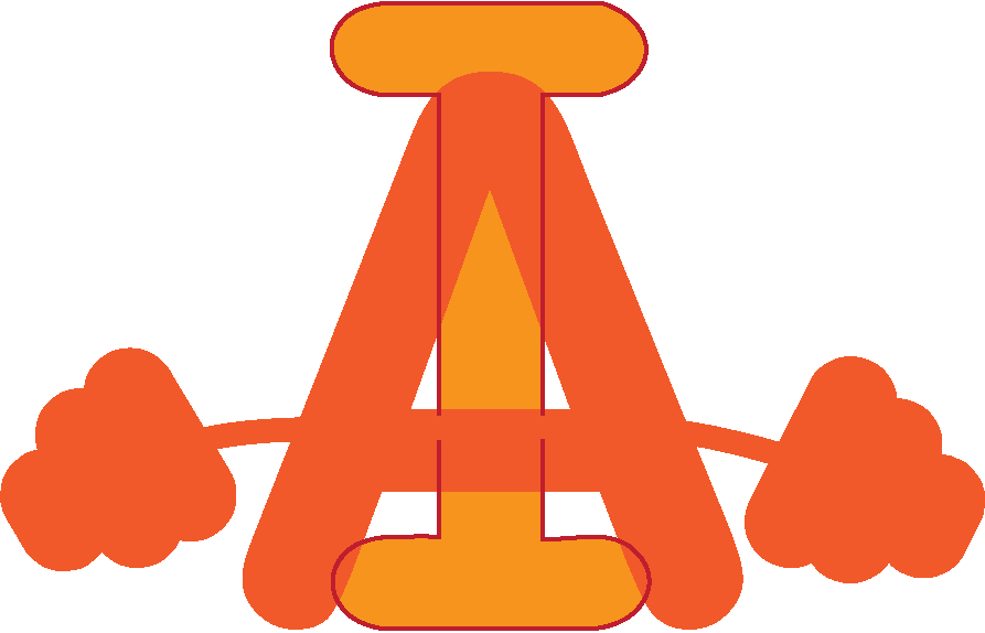
This was my second conceptually designed logo, with this design I developed it by making the barbell a part of the actual letter A. This was to make it more conceptual as I felt it lacked conceptuality. I feel like this blended the logo together and made it all one rather than separate letters and objects. I also changed the colour of the barbell to make it blend in with the bridge of the A. I felt this made my idea more conceptual because it made the object and the letter all into one and it sort of had a double meaning.
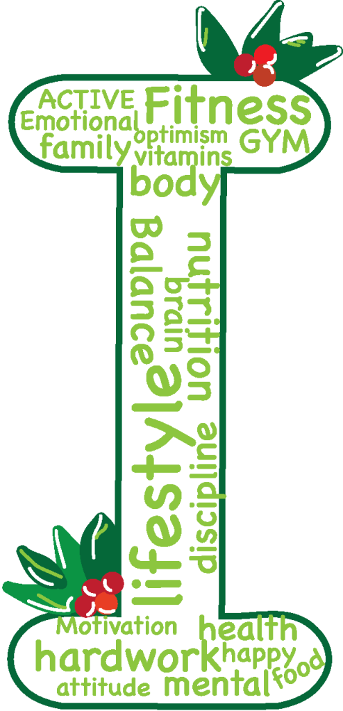
For my second conceptually designed personal logo this was my idea, the words inside the outline of the are words that describe me and my personality traits. These are words that i asked other people for and I asked them to write down the first words that came to mind when they thought of me and so I used these words as part of my logo. The holly in the corners of the logo are because when I was young my nickname was always holly, this was because my birthday was on Christmas day. I used green because it is one of my favorite colours and is a colour that I feel best describes me and went well with the theme of the holly.

This was my second edited conceptually designed logo. The reason I re-edited this was because I felt it was not very conceptual and it was more typographical because of the outline and I felt like it made it much more uniform and strict within the lines. I removed the line because I wanted the words themselves to form the letter I, which was my initial for my first name. This made it more conceptual as the words used to describe me formed my initial.