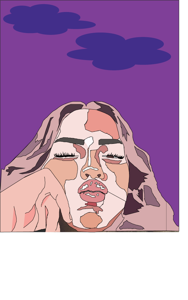
This was my first attempt at a self portrait illustration using Adobe Illustrator. I mainly used the pen tool, whilst zooming in, to pick out shapes and differentiate between the different tones. I used myself as a reference and used a tripod to take a picture of me as if someone else had taken it.
To add a range of depth and tone did tones at a time, meaning that I grouped the different shades together, ranging from light to dark. I used a range of pink and purple tones, as opposed to the usual colours used for a portrait. I made the hair different by adding in the purple, to emphasize the difference in the dark and light tones for the highlights in my hair. I added in a dark purple background to bring the portrait together and the whole portrait was quite light, doing this and making the clouds a lighter purple gave my illustration a mystic feel because of the abstract colours.
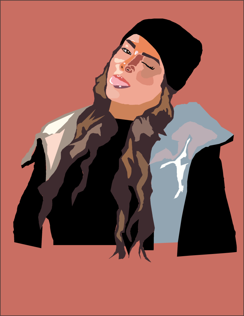
For my second illustration I used more realistic shades for the skin especially as I wanted it to contrast my first portrait, I also wanted to experiment with realistic tones and colours and see how well I could do and I executed this quite well. I got the colours using the eyedropper tool in adobe illustrator, I wanted to get the colours as accurate and realistic as possible so I switched between the eye dropper tool and the pantone solid colours palette in Adobe Illustrator. I did not blur any of the colours together as I quite liked the effect of the colours being separate and sort of like patchwork. However the highlights in the hair are not realistic as I did not use the pen tool to cut them out individually I simply drew a rough shape over where I could see the colours. The reason I used this photograph of me is because I feel like it captures my goofy personality because I am making a silly face. I chose a neutral background colour because I did not want to take the focus away from the portrait itself.