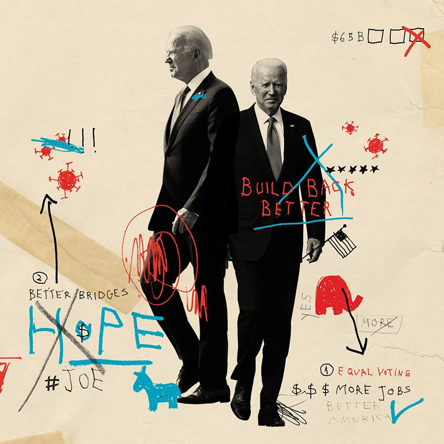
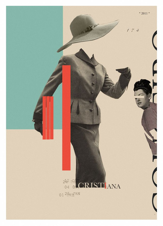
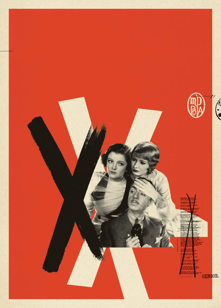
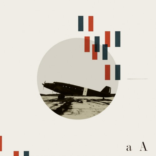
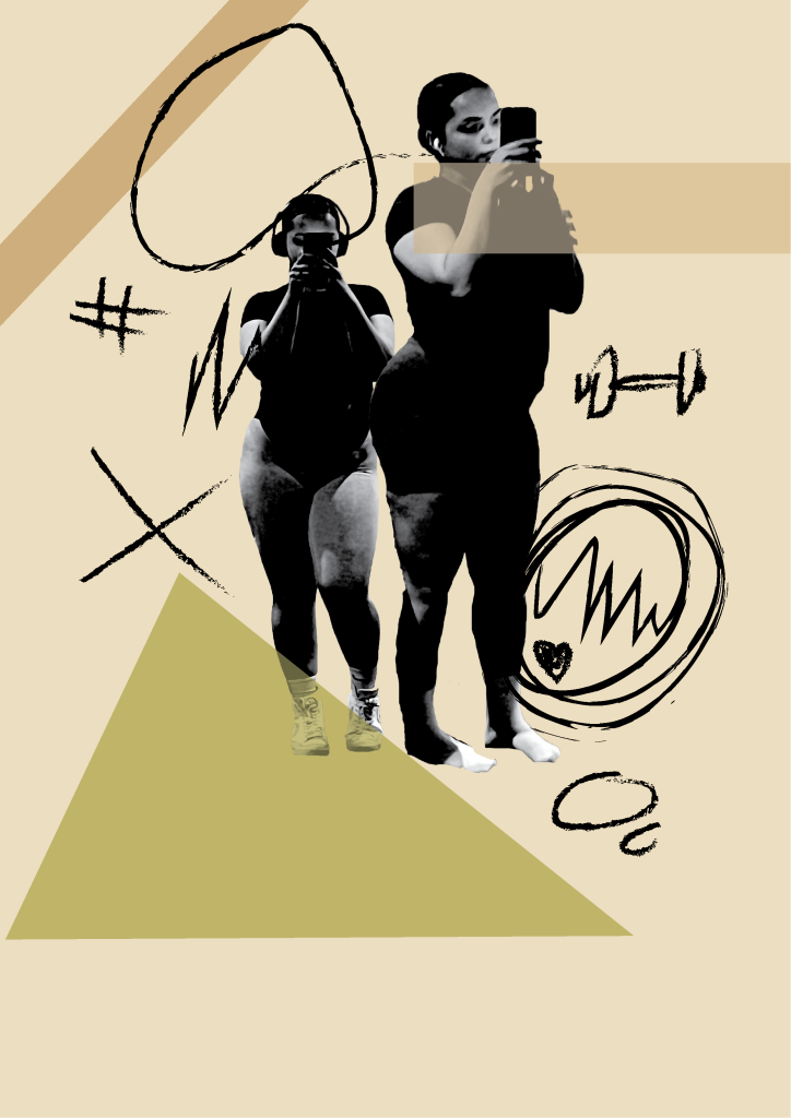
Christiana Couceiro is an artist who is based in Portugal. She had many of her works published in the New York Times and the Washington post. Her style gravitates more towards modern collage and retro images to bring about an understanding about certain political figures or movements A lot of her art work consists of the main focus being black and white and the rest consisting of brighter colours like red, blue and yellow. She does this so that the images may stand out more and it creates more contrast with the background. Christiana includes a sketchy and animated style background to create a barrier between the sharp monochrome image on top and the child like, fun drawings in the background. Some drawings consist of simple strokes and marks. She uses a lot of abstract shapes and lines which reflect the Bauhaus style of art. She uses different graphic techniques to give the piece a graffiti esque feel whilst it still looking put together. Her work tends to often have loads of negative space with a figure or two centering the image, again i feel like this places more focus on who the actual people are or what they are doing in the image as there is not much to focus on.
Christiana's work consists of bringing together a bunch of memories and events and making something new from it. She once stated " I collect memories both personal and collective, national and international, my collages are made from an assemblage of different forms, thus creating a new one".
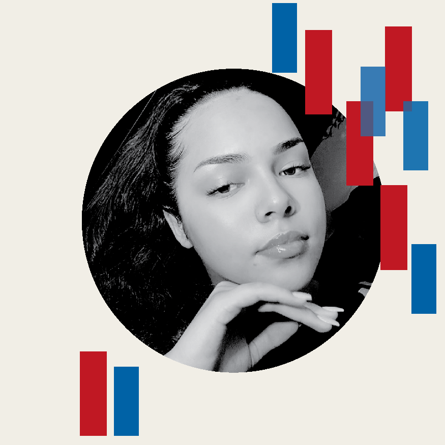
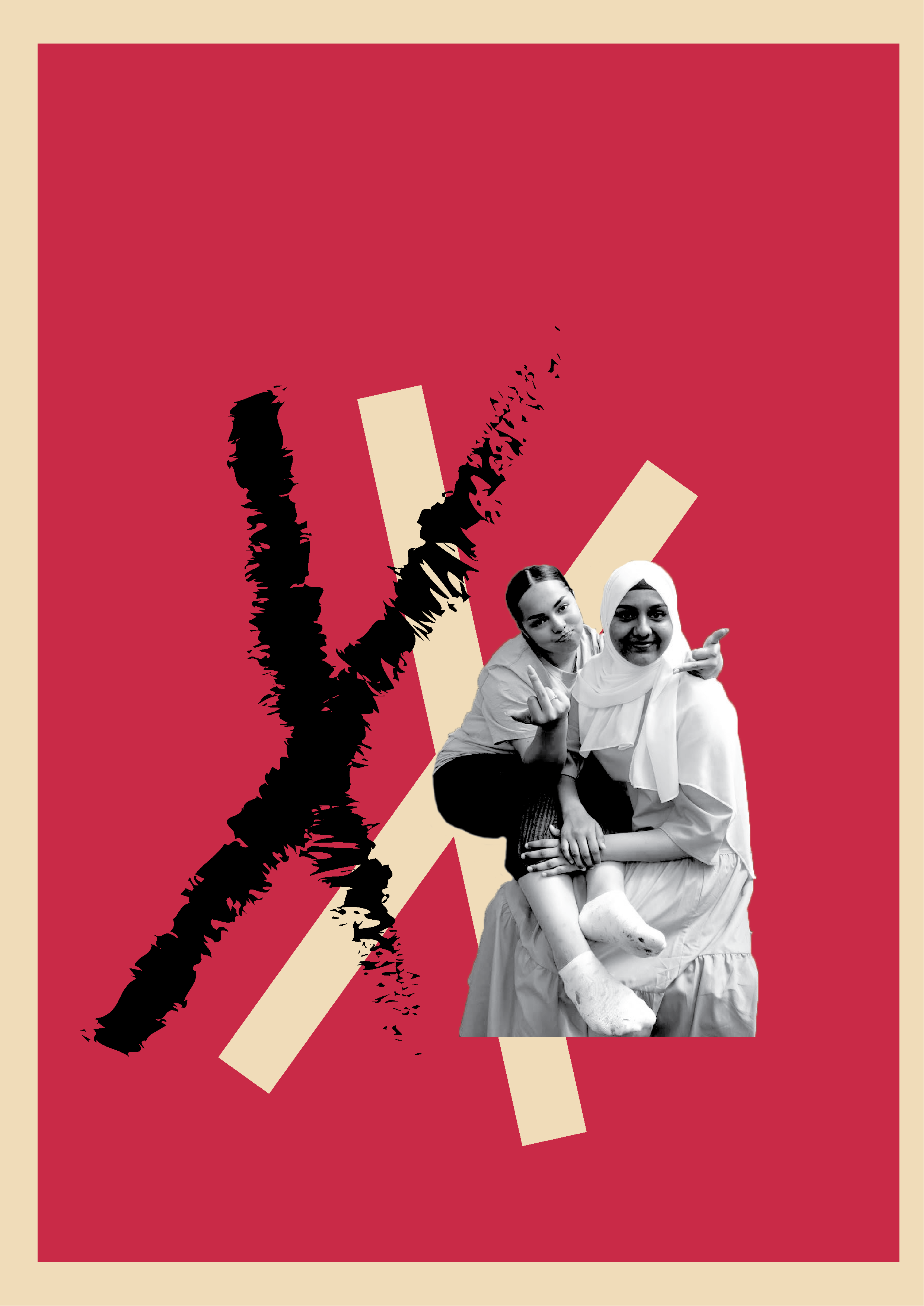
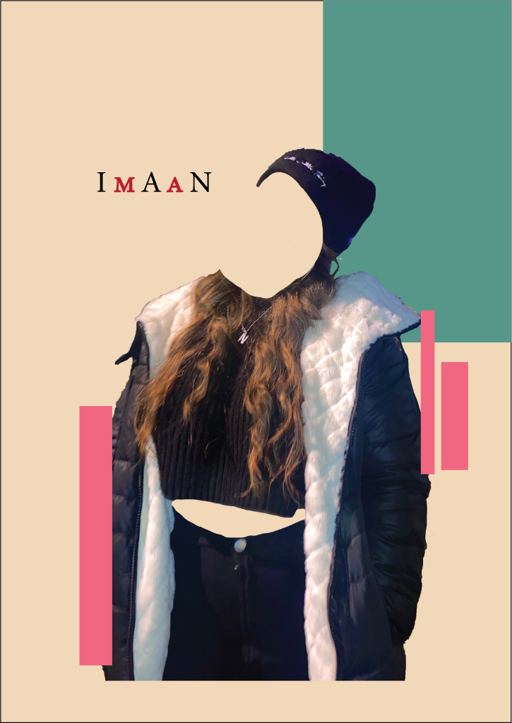
In my responses inspired by Christiana Couceiro I ensured to use similar images of myself or my friends as she did, I also turned some of them into black and white as I made the backgrounds colorful to create a similar contrast. For my first one I used two cut out images of myself taking a selfie at the gym, I used the technique of making markings in the background so I drew a dumb bell roughly to give that same playful effect. I overlapped the images as it makes them look like they flow together slightly better. In my second response I once again converted the image to black and white as it created a nice contrast between the two. I turned down the opacity on the rectangles so that the colours underneath would be visible through each other. My next response consisted of an image of me and my best friend, I thought this image looked cool in black and white and monochrome colours are usually quite sinister and sad, whilst the image I used is a happy and smiling image which makes for an exciting borderline between colorful and boring. I used a charcoal brush within illustrator to create a realistic brush like stroke across the page. For my final response I decided to use an image of me where my face was cut out so only my silhouette is visible. For the writing I used a mixture of both upper and lower case and in both black and red with different colored abstract shapes surrounding the image.