American painter, illustrator, and sculptor Jeff Koons finds inspiration for his works in children's toys, cartoon characters, porcelain figurines, and celebration decor. He often creates sculptures of very easily accessible, ordinary objects on a larger scale with what seems to be very little thinking or significance behind them. A lot of these pieces give off a tacky vibe which seems to be his intention. This makes his art appear cheap due to the simple forms and plastic-looking materials he incorporates into his work, despite the fact that they are quite expensive to produce, which goes against the general public's conception of what art should be. He also plays with the concept that something enormous might appear to be light. But by doing this, he makes us as an audience think about how we regard the things we own and the idea of consumerism as a whole. Salvador Dali and Andy Warhol were the two artists who most influenced Koon's style, which consists of a variety of elements like kitsch, pop art, and ready-made items.
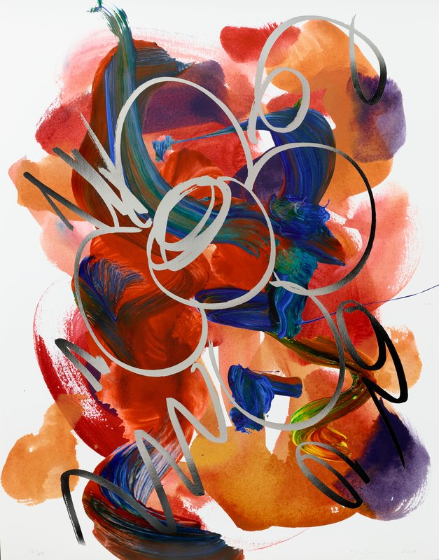
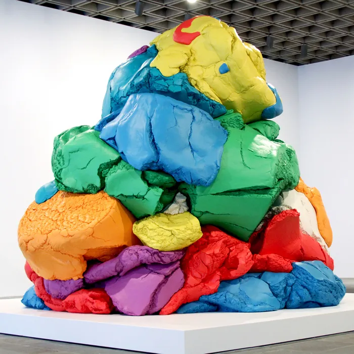
The majority of Jeff Koons' works displayed here are from series, which was his usual method of working. His extensive collection of inflatable pool toys and balloon animals was extremely appreciated and financially successful, bringing in some of the highest auction values of all his creations.
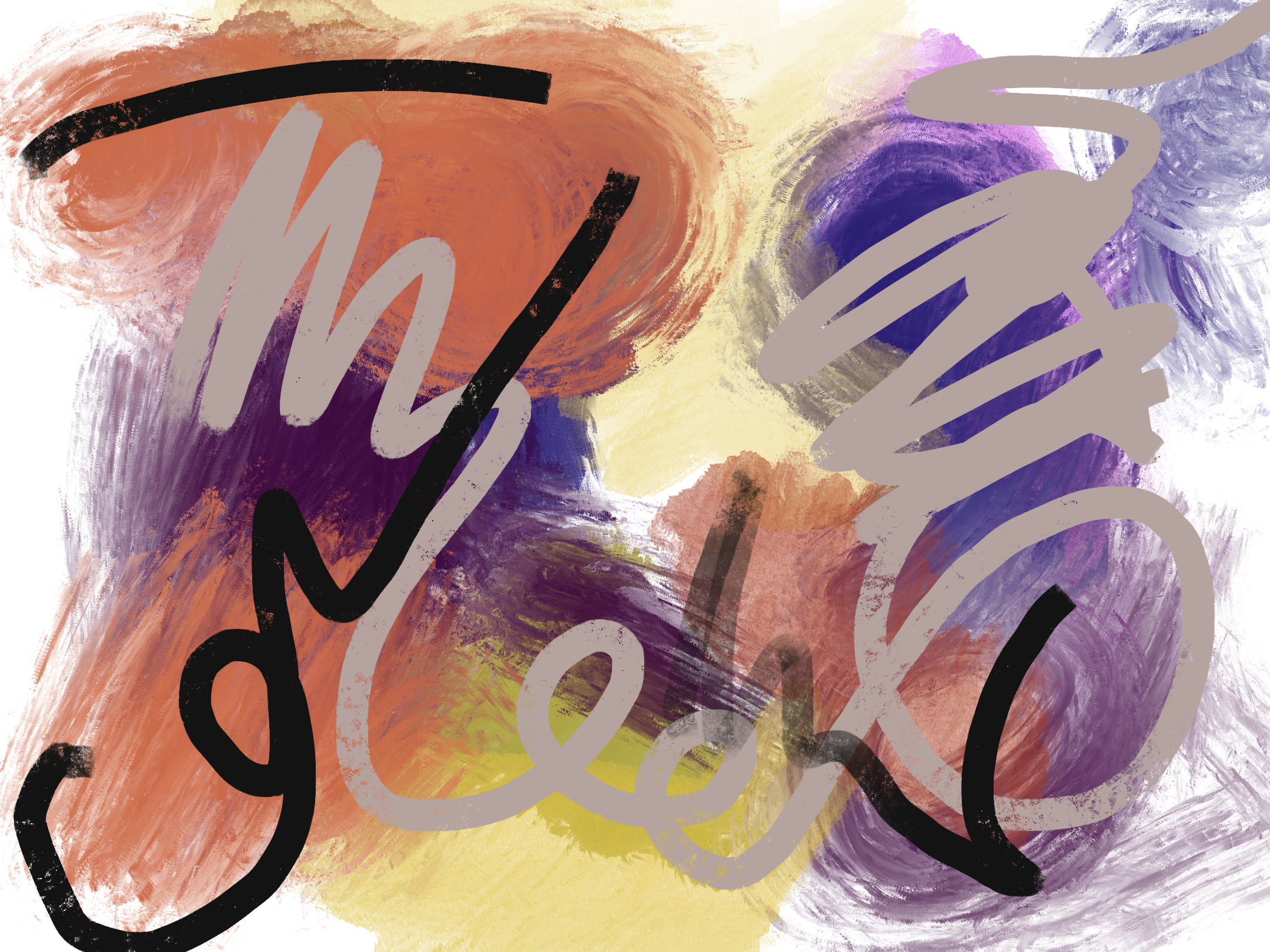
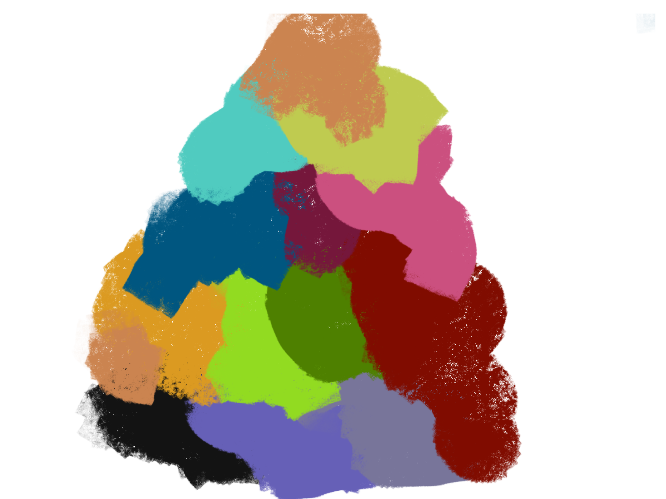
A large number of the pieces by Jeff Koons included here are from series, which were his usual method of working. His large selection of balloon animals and inflatable pool toys had crazy popularity and financial success. While Koons creates them as significant iconography meant to honor and throw back to the simpler periods of childhood, other critics find them to be in poor taste and style and overly commercial. He claims that he is not concerned about how vivid magenta colours can make his artwork appear more straightforward. I created this response piece by using different brush strokes on the procreate app on my ipad, and made sure to blend them using a water colour brush, this gave the effect of the colours bleeding. I also added random pen marks over the top in a darker colour to make it seem more relative to the original piece.
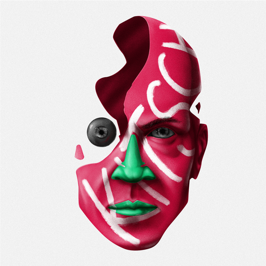
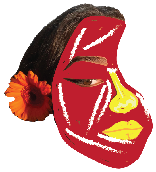
Due to his work's simplicity, I personally don't like it very much as my personal style is much more sophisticated and detailed, therefore I had a lot of trouble trying to make my own drawings in this similar manner. His sculptures are extremely straightforward and uncomplicated initially, making it difficult to design a unique piece, which is another reason I found it difficult to draw much significance from his work. This piece was the most difficult one I redesigned. the detail in which the face looks like an abstract colour is fascinating, where the lips and nose are green but still look very realistic, I really struggled doing this in my redesign on my own face. I used similar colours but changed some and did made the same white marks going across the face using the chalk brush stroke effect.
This piece was fairly simple to redesign as I decided to use a digital form rather than clay as he has used. Once again I used procreate to use the different brushes to create an over lapping effect of each layer of colours.
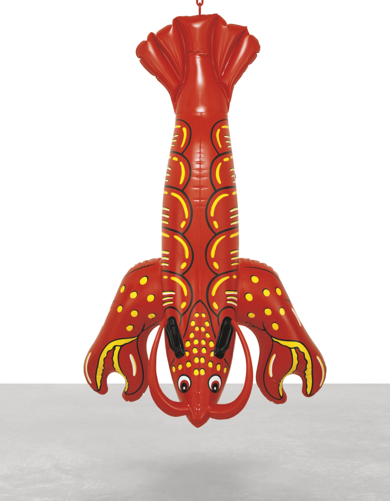
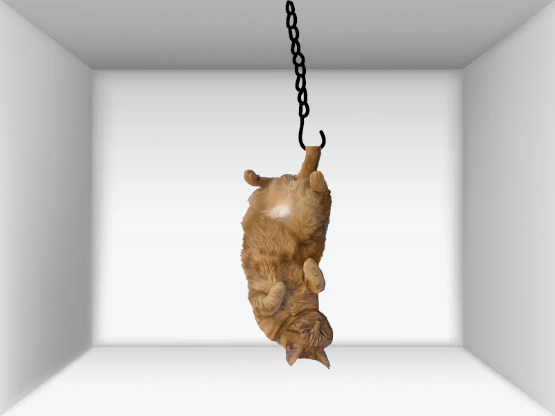
For this redesign I used an image of my cat and drew a hook so it looked as though she was hanging upside down in an almost fetal position.
As a result of its extremely garish appearance and excessive sentimentality, kitsch design is frequently characterised as a form of art that is considered to be of bad taste or quality. In spite of this, some people still find the Kitsch art movement amusing or humorous and still appreciate it. With its outrageous and hilarious nature, kitsch is comparable to the idea of camp.