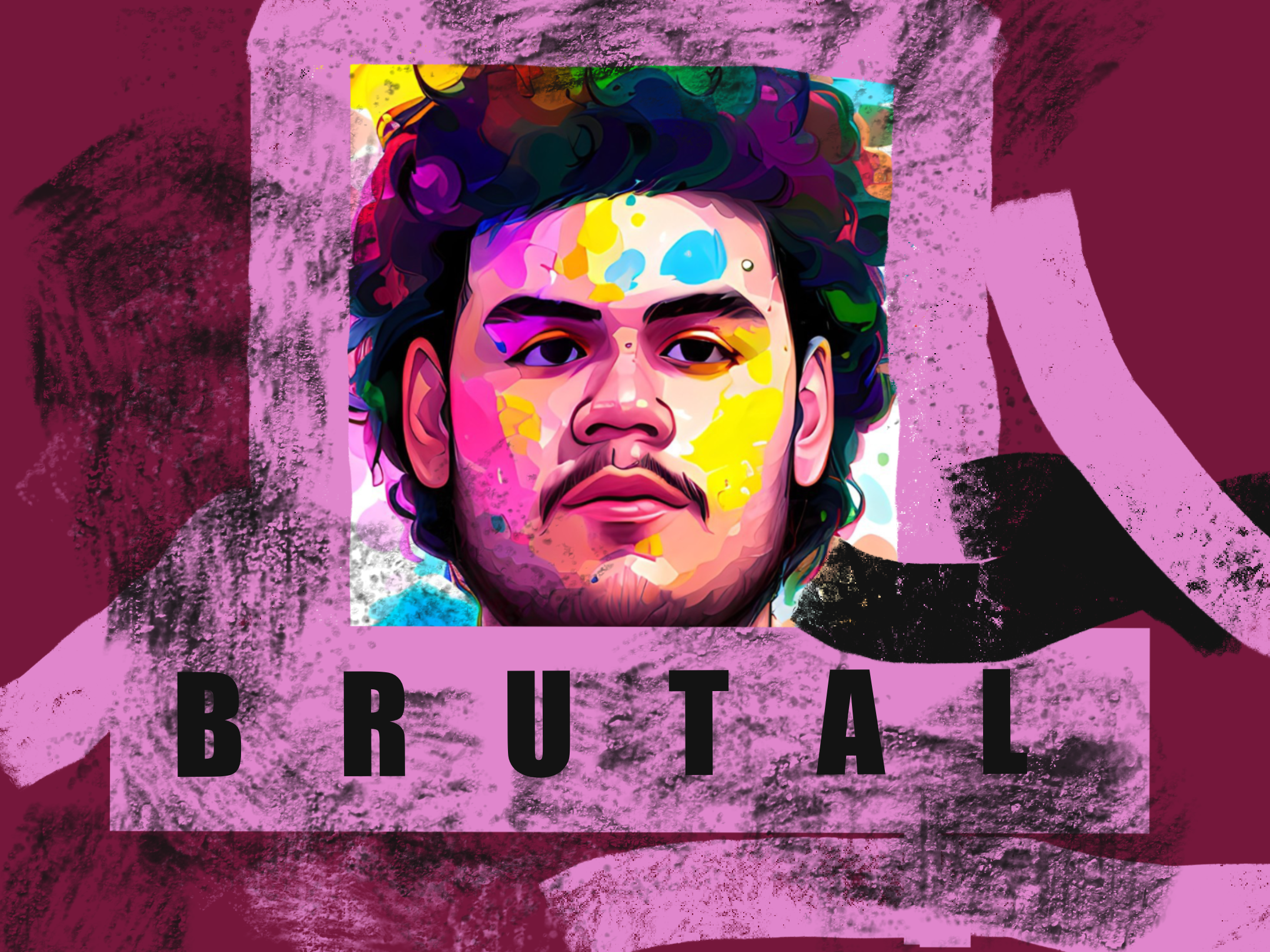
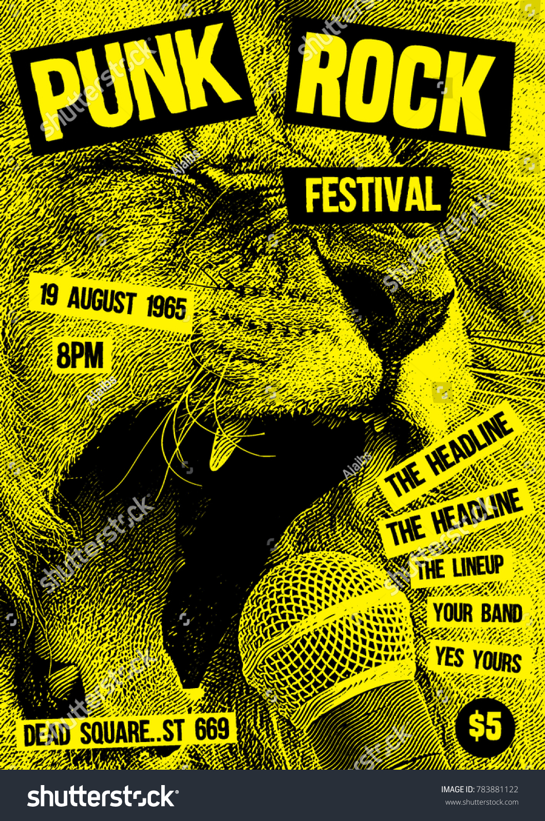
https://www.bing.com/images/search?view=detailV2&insightstoken This artistic trend has influenced graphic design over the years. Its design philosophy and fundamental characteristics are extremely similar in that it avoids ornamentation in lieu of showing the basic components that were used to make it. In some aspects, minimalism and brutalism are similar, but minimalism strips the design down to its core components while maintaining a basic hierarchy, whereas brutalism may seem to completely disregard factors like colour scheme and font. The rawer appearance of brutalist design is frequently attributed to a resurgence of teenage rebellion against the basic, corporate looks that are so prevalent in today's culture. With more widely used forms and visuals being employed alongside a traditional, bold sans serif typeface, modern brutalism is moving towards integrating a lot more ornamental components in their designs. Increasingly, it combines anti-design, brutalism, and traditional design. Despite the fact that anti-design is sometimes compared to brutalism, it supports quite different ideas. While brutalism will still attempt to retain fundamental design components, it will strive to reject against artificiality and lightness. Anti-design frequently tries to rebel against oversimplified design by developing purposely ugly or disorienting designs that lack any visual hierarchy. I redesigned this image using an image of my boyfriends face and animating it. I then added text and used a large charcoal brush over the top with a low opacity to give it a rough and punk like feel.
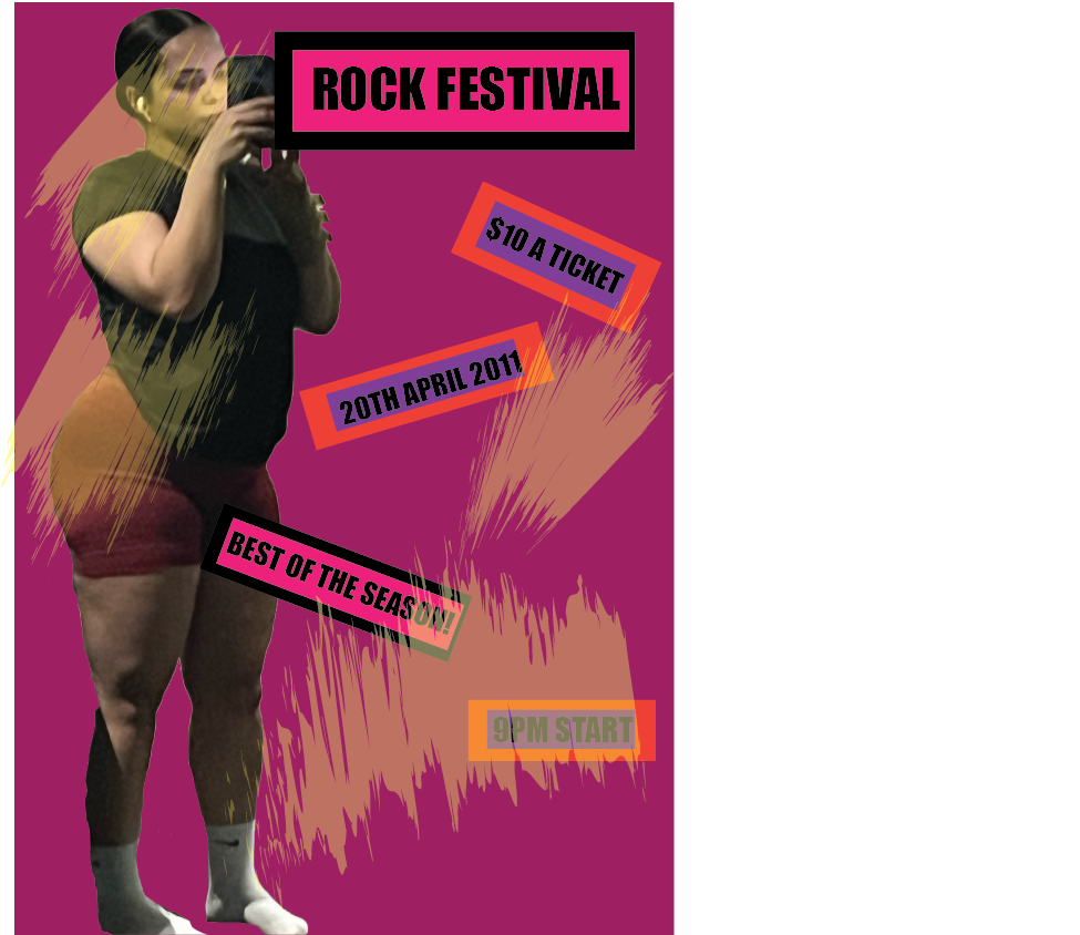
https://www.bing.com/images/search?view=detailV2&insightstoken Because the brutalist art form allowed for such creative flexibility, I thoroughly loved studying and exploring it. Other than maintaining a fundamental visual hierarchy in the design, there are no restrictions on it. In my second redesign I used shaped and text to make it more random and once again added the charcoal strokes over the top as I really felt like this gave a nice effect to the 'punk' design.
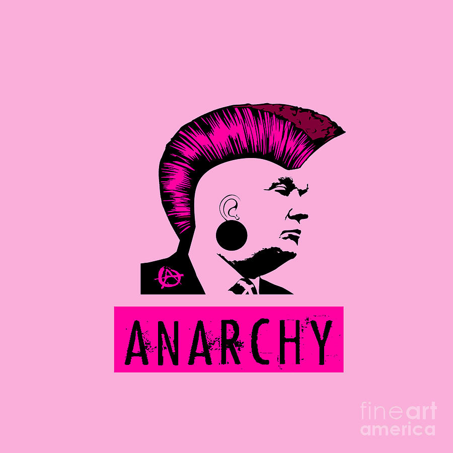
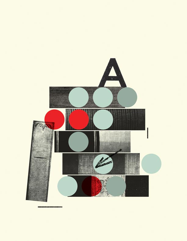
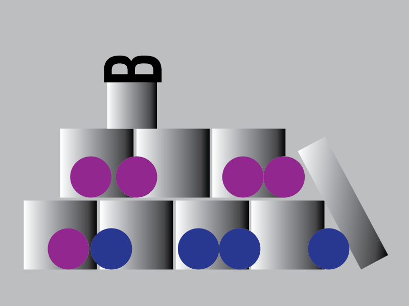
I incorporated lots of black into my pieces to make them look more dull although I added color so it would not look too dingy. I used 'typical' punk and brutalist colour like reds, purples, and pinks, to really establish what the art style was and what message I was trying to bring through my artwork.