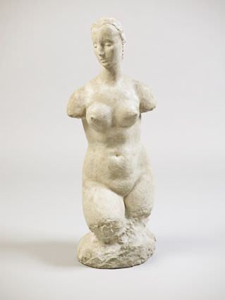
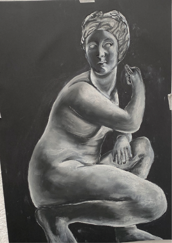
William Lehmbruck is renowned for his sculptures of elongated, slender figures whose sombre, typically disappointed movements communicate reflection and a quiet, gloomy atmosphere. After moving to Paris in 1910 to continue his studies, Aristide Maillol, Auguste Rodin, and Friedrich Nietzsche's theories had an effect on him. He was obliged to go back to Germany when World War I started. He worked while serving as a medic in Berlin and he was released in February 1916 due to hearing issues. During that year he escaped the suffering of war and moved to Switzerland. He was elected to the Prussian Academy of Arts after moving back to Berlin in 1919. Success couldn't make up for his sadness and suffering, which was made worse by marital issues and divorce, once he was divorced, he then killed himself six days later. My response to his work was made using chalk and charcoal as i felt it did his work and technique the most justice, I was able to get all of the highlights and shadows accurately, I did this as I had no access to clay.
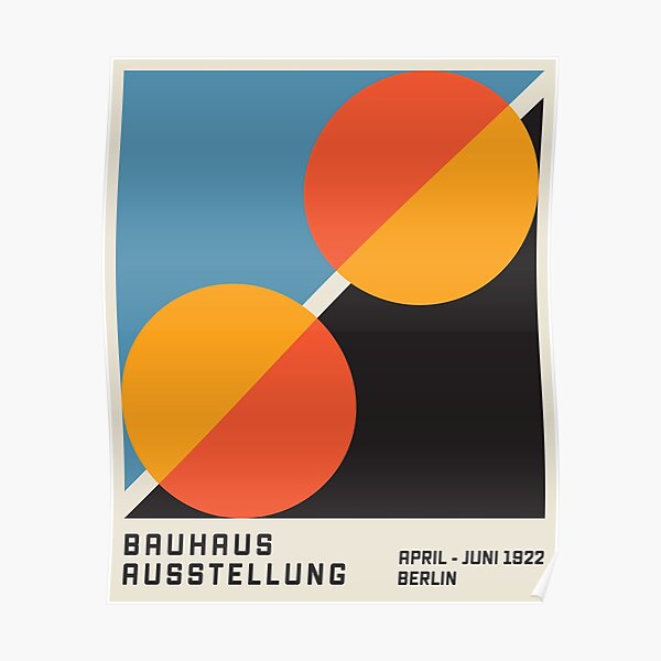
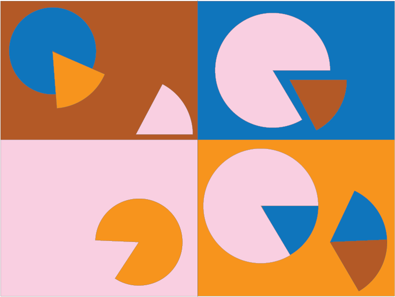
Bauhaus 1922
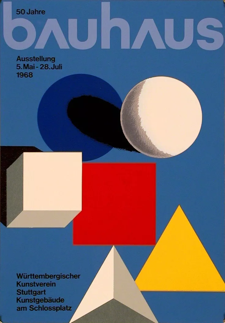
German architect Walter Gropius (1883-1969) established the Bauhaus in the city of Weimar in 1919. Its primary objective was to remake the physical world in order to express the coming together of all the arts for the audience to understand it in a way it had never been understood, which was an unusual idea. In the Proclamation of the Bauhaus (1919), which imagined a utopian trade guild combining architecture, sculpture, and painting into one cohesive creative expression, Gropius defined this idea for the combination of art and design. He created a craft-based curriculum to produce designers and craftspeople capable of producing practical and eye catching products suitable for this new way of life.
I redesigned this piece using circles and triangles, abstract shaped which are a vary common factor in Bauhaus work, I used the similar muted colour, baby pink, brown, blue and orange which created a nice contrast between warm toned and cool toned colors.
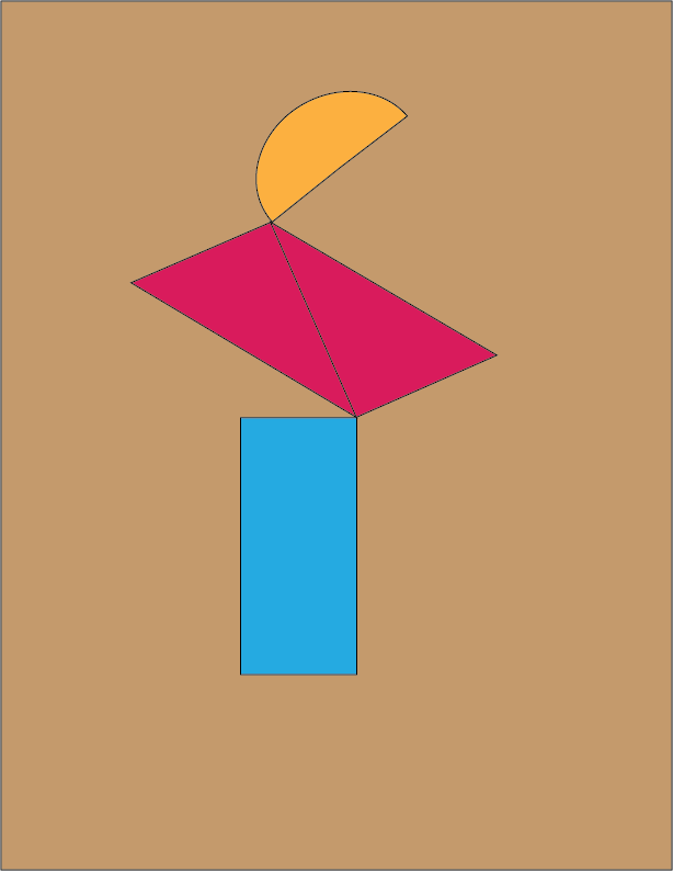
Bauhaus 1968
Both fine arts and design education were combined in the the Bauhaus style. The course work began with a foundational course that engaged the students who came from a wide range of socioeconomic and educational backgrounds into the study of materials, colour theory, and formal relationships in order to prepare them for more particular studies. Bauhaus uses a lot of abstract colours and shapes, my redesign brings this message through very clearly as the background is a very simple and staple colour whereas the shapes I have placed on top are extremely simple and abstracted as are the the colors, bright yet flat and solid.
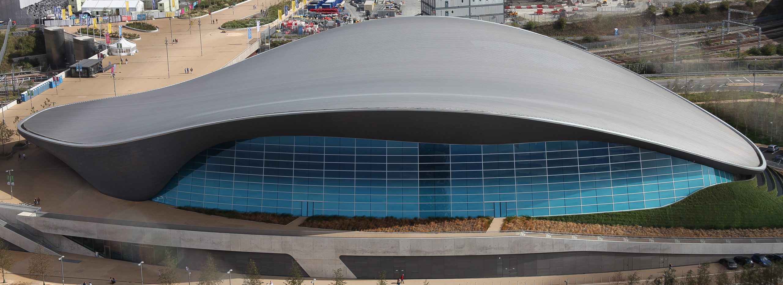
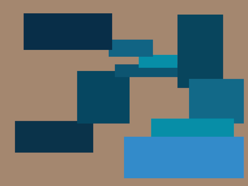
Zaha Hadid 2004
Zaha Hadid was an Iraqi British architect who used abstracted paintings to visualize her concepts and buildings and bring them to life. She is most known for her radical and simplified designs. She gained recognition once winning her entry for 'the peak', at this time people were more focused in on post modernism therefore Hadid's designs stuck out and made her unique as opposed to other architects at the time. Smooth curves are a recurring statement in Zaha's designs; they give her structures a certain fluidity and sleekness. In recognition of her preference for using curves rather than crisp, angular forms, Hadid has earned the moniker "Queen of the Curve." Architectural conventions were frequently questioned by Hadid. She gave preference to aesthetics above practicality and used minimalist design principles to produce ornate, elaborate constructions. For my redesign I simply drew the shapes I could see, I drew squares in different shades of blue which I collected from the image using the eyedropper tool.
Clara Lieu 2011
Clara Lieu is a famous artist who's work has been exhibited all over New York in countless galleries and museums, She is also a professor and teacher and educates students in art. I did this redesign using printing ink and a printing screen. I first placed the ink on the screen then i wiped it off using a squeejee, all excess ink that should have came off was removed and once placing the paper on the inside, my print was revealed.
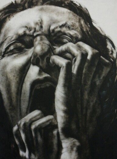
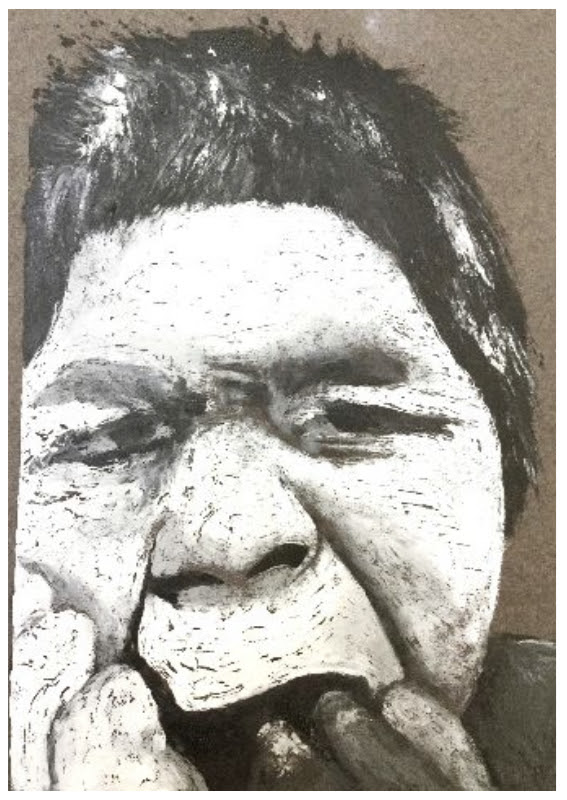
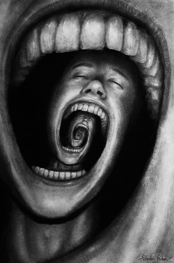
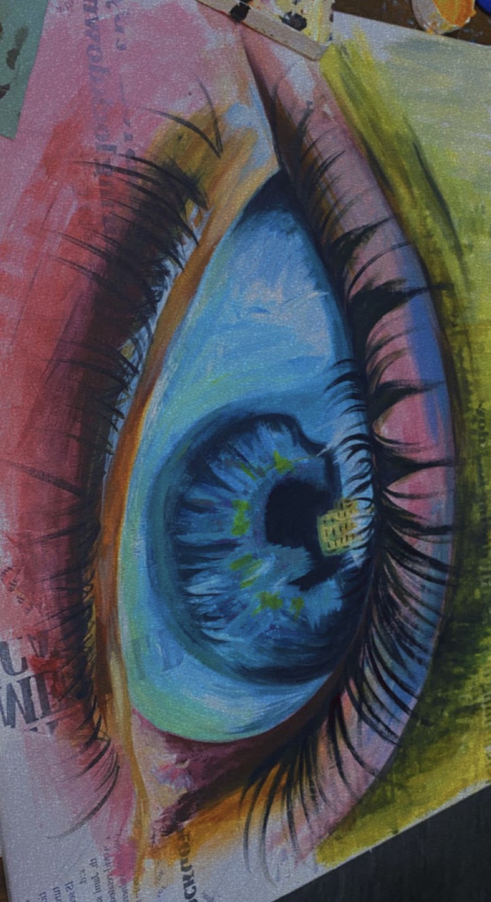
Seb Maestro 2011
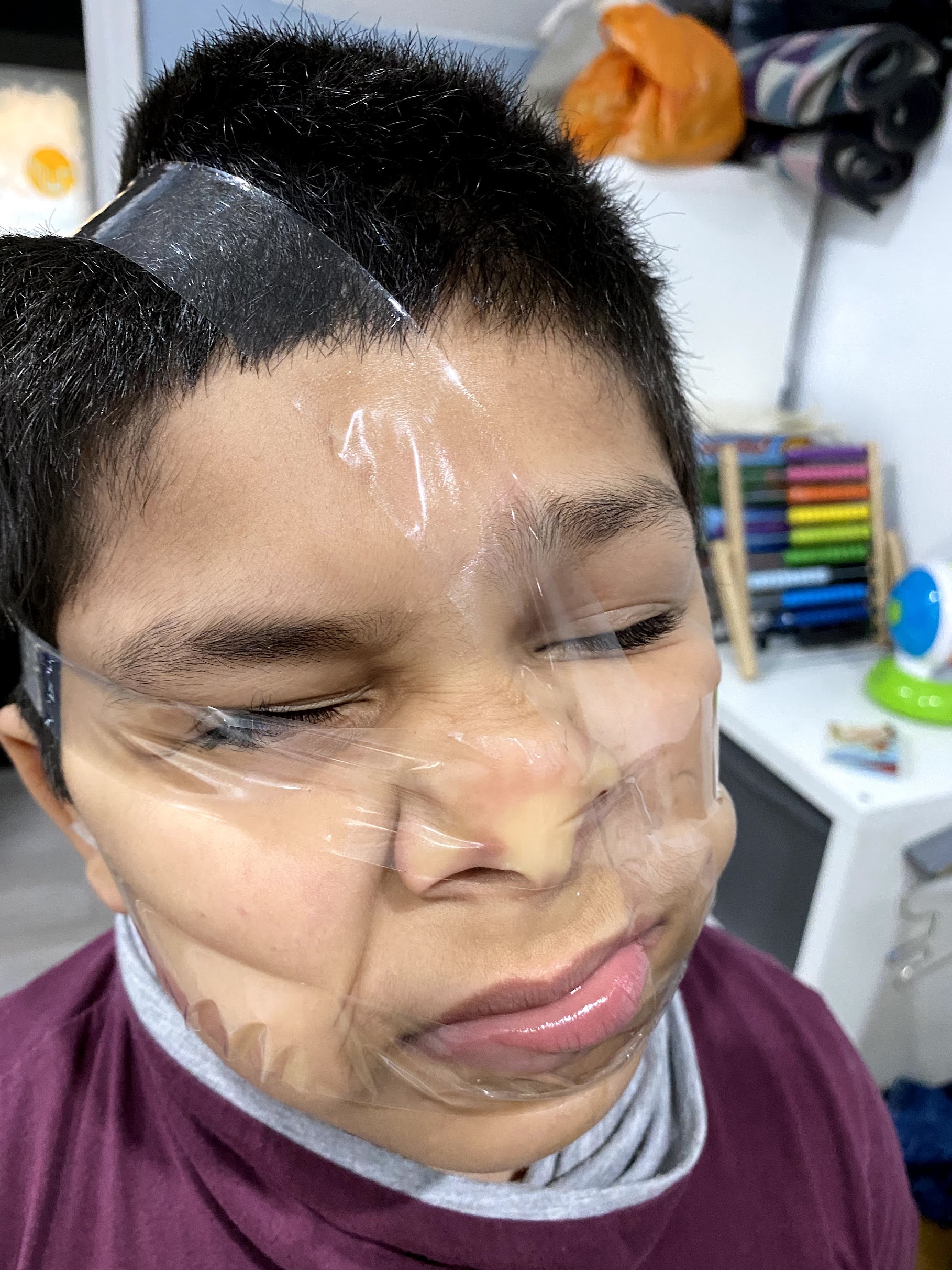
My redesign here of Seb Maestro's work is a photography piece, it revolved around depression and feeling stuck, as though it is permanent and will not leave, therefore I placed sticky tape around my brothers head and face to distort his face, as Maestro distorts his images and drawings. The photograph I took captures the feeling of being 'stuck' perfectly, and i related it to the original by wrapping it around a fair few times, to encapsulate the spiral, as though the feelings are making them spiral out of control.
Marcus Henry
In addition to teaching art history at Oxford University's extension programme, Marcus served as the housemaster and art master at Monmouth School from 1907 to 1946. The Wye Valley Arts Club was founded in 1939 by an art master who was still residing at "Kilmarnock" in Hereford Road, Monmouth with his wife Ethel May, herself an artist. He presented works at the Royal Academy, the Royal Cambrian Academy, the Royal West of England Academy, and, as an Associate, the Liverpool Walker Art Gallery. He also presented works at the Paris Salon. At the age of 75, Marcus Henry Holmes passed away in Resthaven, Pitchcombe, Stroud, Gloucestershire on February 20, 1951. Marcus Henry Holmes was from Kilmallock, Hereford Road, Monmouth. Marcus Holmes was his printed signature on each piece.
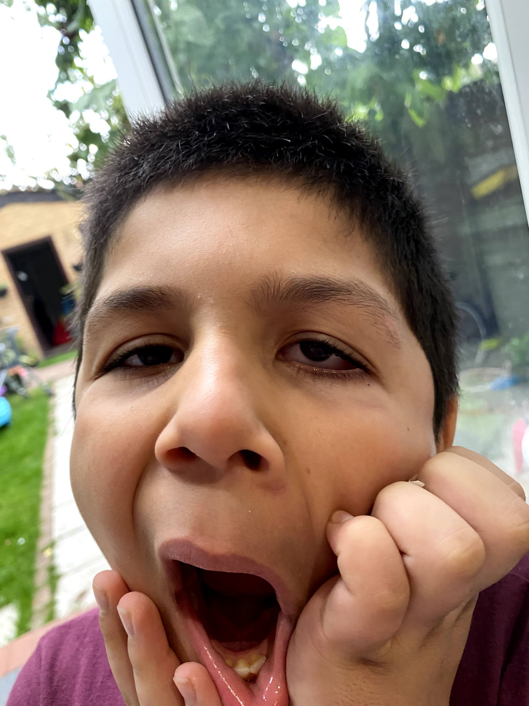
This was another Photography piece, I quite enjoyed taking these photographic pieces and telling my brother to pose is distorted ways, I also feel as thought these would make interesting paintings.
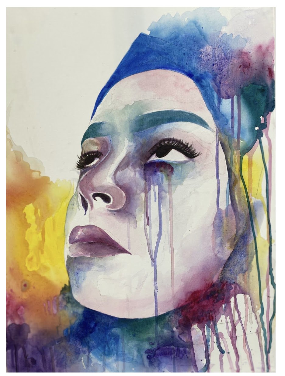
Agnes Cecile 2014
She first used the name "agnes-cecile" when she uploaded her first watercolour paintings online. She continued chasing her career after graduating from a high school for the arts, experimenting with various painting methods and learning how to express herself her artwork. She quickly gained popularity on social media, which gave her access to a sizable global audience. Following a number of solo shows in Rome, she participated in activities, led seminars, and worked on projects in several international locations throughout the US, Canada, and Europe.
Since she became an ambassador for Winsor & Newton, she seized the opportunity to raise the calibre of her workshops. She published her first art book, a compilation of ten years of work, in 2018.
I redesigned this using watered down acrylic paint on a canvas as I found it easier to work with than watercolor and I found it to be much more opaque and full of color. I stood up the canvas and dripped water along the page to create the dripping/melting effect especially around the eyes and headscarf.
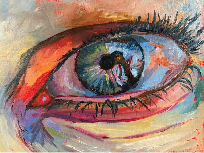
Vita Schagen 2020
I redesigned this using acrylic paint and some ink around the iris as it was of a darker and thicker consistency. Dutch artist Vita Schagen has had work shown both domestically and in Russia. She wants to express all aspects of her life, such as her feelings, dreams, and love, through her artwork. Depending on her mood, the subject, and the feelings she wants to convey, Schagen uses a variety of painting techniques. On canvas, she uses enamels, lacquer, and oils to produce her works of art. I used hints of yellow as she does to help make the highlights stand out in a unique way without them just being white. I also mixed a lot of the colours using yellow so that they would have the same undertones and would flow together more cohesively.
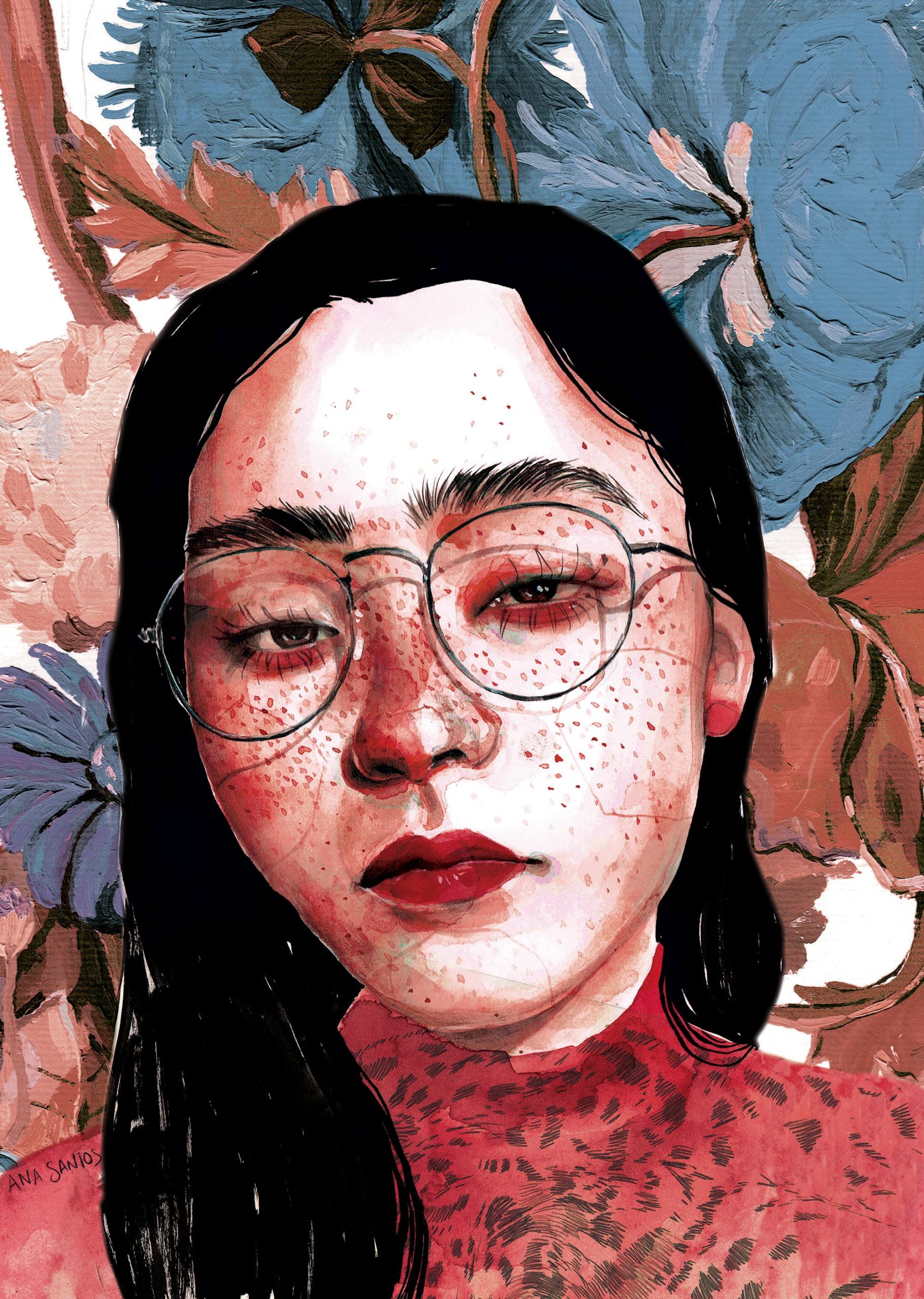
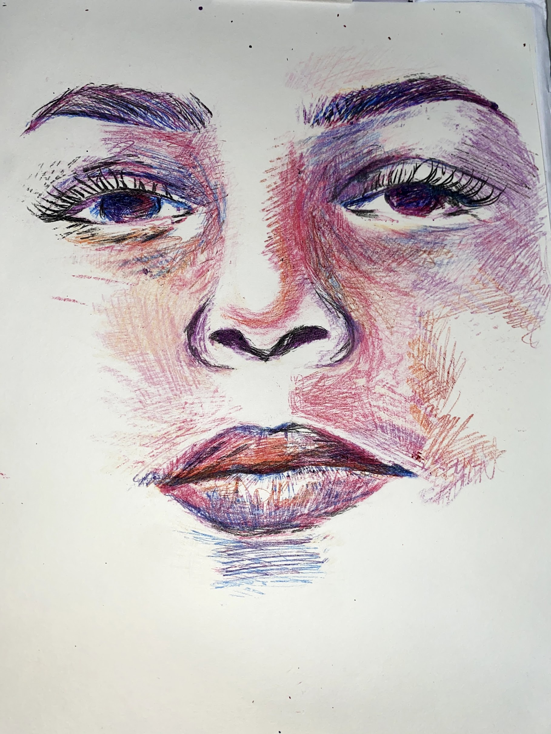
Ana Santos 2020
I created this piece using coloring pencils and I blended using an orange shade as I felt it went the best over the shades of pink I used inspired by Ana Santos' work. I use a textures table underneath the paper whilst I was drawing to create texture around the face where the artist would typically use freckles to create more dimension.